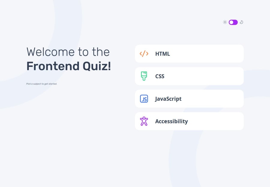
Design comparison
Solution retrospective
I am proud of the final result, but in the next project, I will create a folder for each page and a JavaScript file for better organization of the code and improved readability.
What challenges did you encounter, and how did you overcome them?I encountered a challenge using the same JavaScript file for all pages, but for the next project, I will use iframes in the HTML and separate the code into folders for each page.
Please log in to post a comment
Log in with GitHubCommunity feedback
- @dylan-dot-c
A quick suggestion as I cant review all of this is that you dont have to fetch the json file. You can just convert it to a js file and export it as a constant object. You already know what the data is so no need to fetch it again if you already have it. Only in cases like fetching dynamic data from an api then would you use fetch as that data can change.
Marked as helpful - P@YuliaLantzberg
Hi. It's working good and responsive. Just a small visual bug. When it shows the correct or incorrect answer, the text is moving to the center. It is because you use justify-content space between on the three elements of the option. You can inject the icon in span inside the p tag, to group it only with the text of the answer and then space between them will move only the icon and text will stay on its place. Or you can use the translateX on the icon. But it is not perfect as you don't really know the distance you want to move it.
Join our Discord community
Join thousands of Frontend Mentor community members taking the challenges, sharing resources, helping each other, and chatting about all things front-end!
Join our Discord
