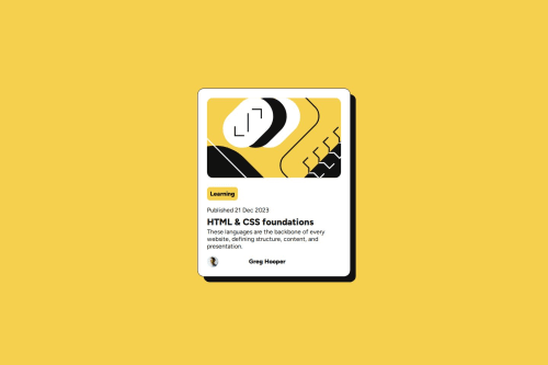
Submitted over 1 year agoA solution to the Blog preview card challenge
Frontend Mentor | Blog preview card
@Jhonatanjacome07

Solution retrospective
What are you most proud of, and what would you do differently next time?
I'm proud of being able to add an envelope behind my main card. Next time, I want to add some kind of animation or maybe blur the bottom part to make the main card stand out.
What challenges did you encounter, and how did you overcome them?When adding the pseudo-element, I forgot to add z-index: -1 to place it below my main card. After doing some research, I realized I needed to add it, and then I was able to continue with the challenge
Code
Loading...
Please log in to post a comment
Log in with GitHubCommunity feedback
No feedback yet. Be the first to give feedback on Jhonatan Jácome's solution.
Join our Discord community
Join thousands of Frontend Mentor community members taking the challenges, sharing resources, helping each other, and chatting about all things front-end!
Join our Discord