

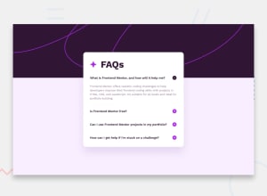
Design comparison
SolutionDesign

Solution retrospective
What are you most proud of, and what would you do differently next time?
❤Things I've tried
Accessibility
- Used
aria-controls,aria-expandedfor Accessibility - Added proper alt text on image button ex.
Expand answer/Collapse answer - Tested WCAG evaluation tool on WAVE
- Checked HTML Markup on Validator
Others
- Scored 99% on Google PageSpeed Insights
- Responsive for Mobile, Desktop devices
- Tried smooth transition on buttons
💪Things I should improve
Javascript
- At first, clicking the button to open FAQ, it unfolds well depending on the content. However, resizing the screen display cuts the text area of the answer. I have no idea how to solve this😂
Please let me know if there are any areas of improvement! Thanks :D
Community feedback
Please log in to post a comment
Log in with GitHubJoin our Discord community
Join thousands of Frontend Mentor community members taking the challenges, sharing resources, helping each other, and chatting about all things front-end!
Join our Discord