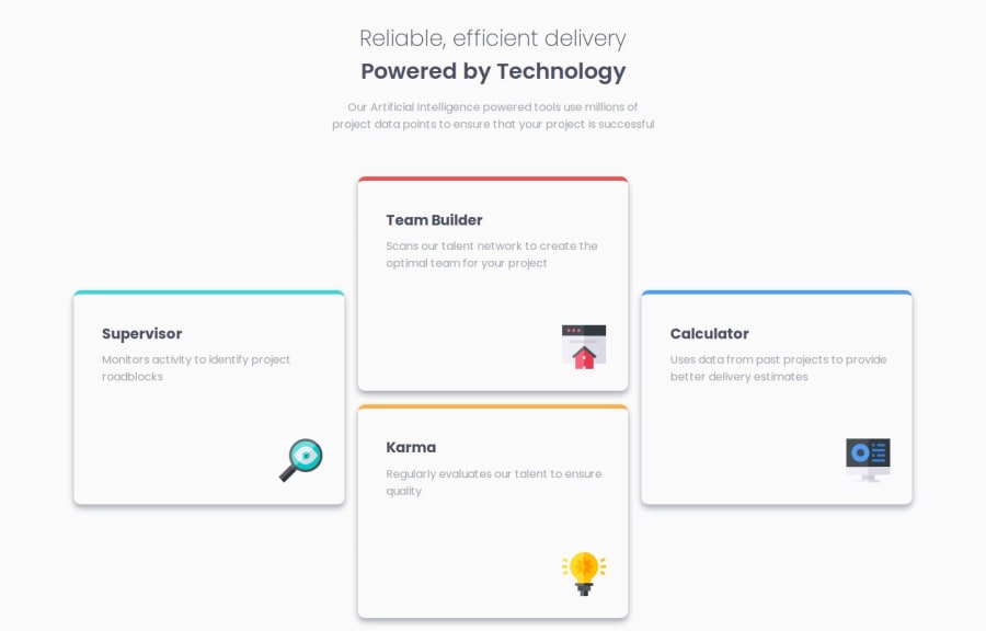
Design comparison
Solution retrospective
Its my first project with Grid system and i'm overall happy with what
ve done.
Overall everything is okay, execept for the height of the main in mobile design.. i tried vh on the main and i tried many different aspects and i really can't understand why does it cut off the end of the last card or maybe why i can't give it more height.. if anyone help me or tell me how to fix it, will be really great... thanks! Also any other feedback is welcomed...
Community feedback
- @KapteynUniversePosted 18 days ago
Hey Erkant, nice job.
Problem comes from the
height: 70vh;
on the container section. You probably didn't see but footer is also on top of the karma card because of that too. Section is overflowing after the team builder card. Avoid using hard coded values like that. Use min-max width/height instead.Marked as helpful1@erntTt94Posted 18 days ago@KapteynUniverse Thank you! I change it to min-height: 70vh; also changed the width to min-width: 86%; max-width: 96%; and now is perfect.. i think now is much better... also i can't understand why my Solution/Design is different when i upload it to github.. i try and work at 1440width like it says in the style-guide, but everytime there is a difference... PS: i solved it diffently and also worked - on the mobile design i set height to be 100% insted of 70vh hard coded from the desktop design..
0@KapteynUniversePosted 18 days ago@erntTt94 It is inevitable without figma file. Needs an educated eye to see exact gaps, font sizes etc. It doesn't need to be pixel perfect. Don't worry about it much. What's important is learning and making it responsive, accessible
1
Please log in to post a comment
Log in with GitHubJoin our Discord community
Join thousands of Frontend Mentor community members taking the challenges, sharing resources, helping each other, and chatting about all things front-end!
Join our Discord