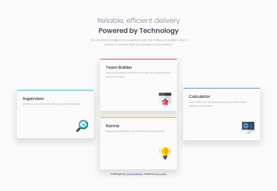
Four card section using SASS and CSS Grid
Design comparison
Solution retrospective
The fact that I was able to learn SASS/SCSS with this occasion, although I am aware of the fact that SASS might be more useful with more complex solutions. However, I could say I feel proud of working on making the site responsive.
What challenges did you encounter, and how did you overcome them?I was unfamiliar with CSS Grid with the way I should use grid-template-areas and this problem helped be become more comfortable with it.
Check please the site's responsiveness. I am still not very confident with it so please give me harsh comments :D
Community feedback
- @sonmikrafftPosted 9 months ago
Looks amazing! Your grid solution is smart. The site's responsiveness works, but I would suggest a different style for the tablet size (either choose the same as the desktop or use a 2x2 grid).
Your SCSS looks good, too. However I would move the main part into another file than the style.scss. You could create separate .scss files for the imports (e.g., the style.scss), the media content, and the main styling (global.scss or another file).
Amazing work!
0
Please log in to post a comment
Log in with GitHubJoin our Discord community
Join thousands of Frontend Mentor community members taking the challenges, sharing resources, helping each other, and chatting about all things front-end!
Join our Discord
