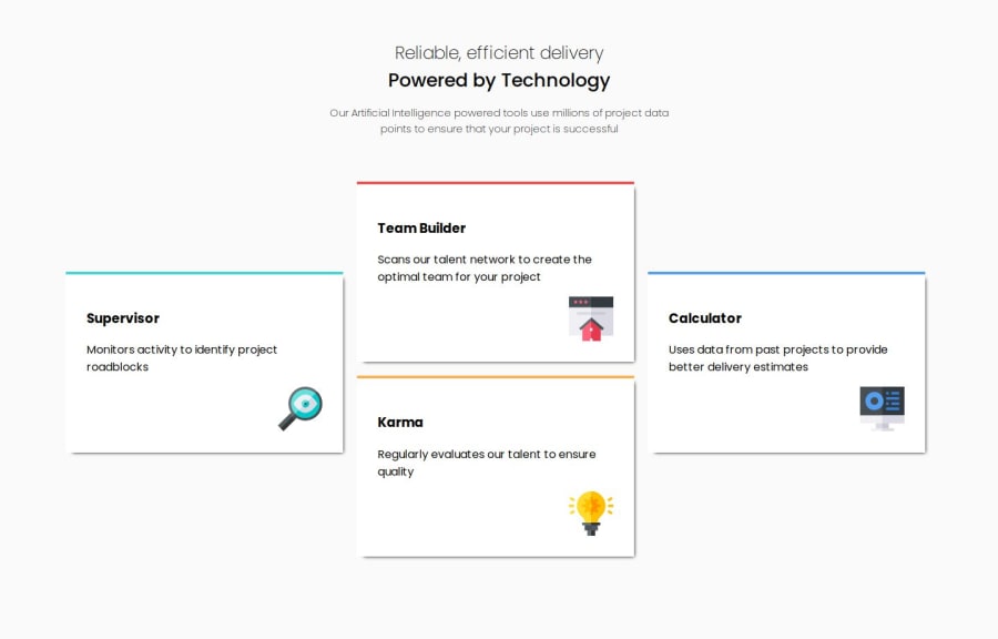
Design comparison
Solution retrospective
I think I managed to recreate the responsive side adequately. I used the CSS properties fairly well to make it similar to the prototype
What challenges did you encounter, and how did you overcome them?The responsive part put me to the test. I spent some time setting it up and I think it turned out well
What specific areas of your project would you like help with?Make it the same as the prototype in every way. So, the css part of margins and sizes
Community feedback
- @hitmorecodePosted 4 months ago
Well done. I took a look at your html and css and there's still some work to be done.
- When you use a container, that container is meant to contain the content on the page. As it is right now the container is only holding the header of the page.
- The html structure should look something like this;
<body> <main> <section> // here you can add your text </section> <section> // this area is for the cards <div></div> <div></div> <div></div> <div></div> </section> </main> </body>- A page must have one
<h1>tag.
// this is what you have <div class="container"> <span>Reliable, efficient delivery</span> <br> <b>Powered by Technology</b> <p> Our Artificial Intelligence powered tools use millions of project data points to ensure that your project is successful</p> </div> // change it to this <div> <h1>Reliable, efficient delivery</h1> <h2>Powered by Technology</h2> <p> Our Artificial Intelligence powered tools use millions of project data points to ensure that your project is successful</p> </div>- When using a h1 to h6 or a p tag, you don't need to add
<br>. These elements are block elements, every one of these elements occupies it's own row. - Don't add font-family inside the CSS reset, place it in the body. This is what should be inside a simple CSS reset;
* { margin: 0; padding: 0; box-sizing: border-box; }- Don't add max-width on the body (unless it's necessary) in these case it's not necessary.
- The border on top of the cards will not work. Add border radius on the cards and see what will happen.
- When you have elements with classes or id's. You don't have to target them by using a parent element.
// because you have the class supervisor, you don't need to use main. .supervisor { border-top: 4px solid hsl(180, 62%, 55%); background-color: white; width: 400px; padding: 30px; grid-area: supervisor; margin: 130px 20px 150px 20px; box-shadow: black 5px 5px 5px -5px; }- If you add
position: relative;on (for example) supervisor card. You can do this to create the border on top.
.supervisor::before {
    content: "";
    position: absolute;
    top: 0;
    left: 0;
    height: 5px;
    width: 400px;
    background-color: hsl(180, 62%, 55%);
}
Your html and CSS needs some work to be done. Give it another try and see if you can manage to fix it.
I hope you find this helpful. Keep it up 👍👌
0 - P@Lo-DeckPosted 4 months ago
Hi well done for this challenge,
Use a
divwhen there is no other choices, you can usesection,article...example:
<div class="supervisor">to<section class="supervisor">.It's easier to start with a mobile-approach FreeCodeCamp.
Your breakpoint at
375pxis not well set.It's better to use
emorreminstead ofpx. FreeCodeCamp. FreeCodeCamp.Your website is not center with a big screen (2560*1440), you can check it out with the developer tools.
You can center it with
display: flexordisplay: gridon thebody.Hope to be helpful.
0
Please log in to post a comment
Log in with GitHubJoin our Discord community
Join thousands of Frontend Mentor community members taking the challenges, sharing resources, helping each other, and chatting about all things front-end!
Join our Discord
