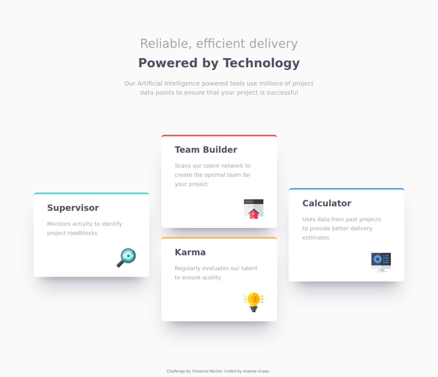
Design comparison
Solution retrospective
How did others go about changing the display from desktop to mobile? If I wanted to take the time I could have tried simply using grid, but I wanted to keep it simple with display: block in the mobile then used a media query to change to display flex with auto margins for the desktop.
Getting more comfortable with everything! This was pretty easy compared to the last time I tried one of these.
Let me know what y'all think!
Community feedback
- @Itsmoe16Posted over 3 years ago
The design overall is good but the margins between the cards should be smaller, and the cards sizes should be smaller too, Hope this helps.
0 - @skyv26Posted over 3 years ago
My friend, your design is ok for big wide screen, as I saw that your design is also responsive but your card is going outside the mobile screen please do follow and make little bit change, then all will be fine ok
.supervisor {
width: 100%;
}
0
Please log in to post a comment
Log in with GitHubJoin our Discord community
Join thousands of Frontend Mentor community members taking the challenges, sharing resources, helping each other, and chatting about all things front-end!
Join our Discord
