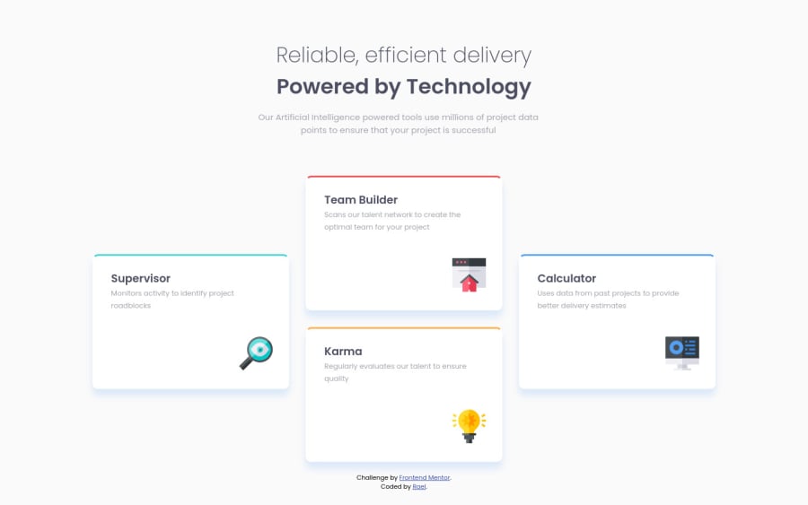
Design comparison
Solution retrospective
A simple project that offered me a bit more insight when using display: grid. It helped shorten my stylesheet quite a bit and made me realize how useful it can be not only when positioning elements on the page but also writting less while gaining the same or even better results!
As always advice and feedback are always welcome!
Thank you in advance! ^^
Community feedback
- @tedikoPosted over 3 years ago
Hello, Rael! 👋
Congrats on finishing another challenge! Your solution looks very good and also responds well. Here's my few tips:
- Maybe instead of adding icons in HTML use
::beforepseudo-element on.main__card? It would be nice touch.
Good luck with that, have fun coding! 💪
1@RaelianPosted over 3 years ago@tediko Thank youfor the kind words! Also, that's a great idea since it would mean one element less to use! I actually forgot that I could use it like that.
Thank you for the advice! ^^
0 - Maybe instead of adding icons in HTML use
Please log in to post a comment
Log in with GitHubJoin our Discord community
Join thousands of Frontend Mentor community members taking the challenges, sharing resources, helping each other, and chatting about all things front-end!
Join our Discord
