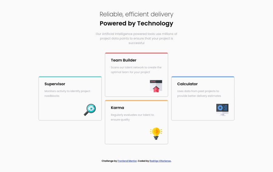
Design comparison
Solution retrospective
Hello everyone ! This is my second completed challenge. I accept positive and negative code feedbacks.
Thanks !
Community feedback
- @grace-snowPosted over 3 years ago
Hi
Really annoying i just wrote you some feedback then accidentally deleted it 😭
The gist was as follows
- looks good overall and well structured html ☺
- top text misaligned on mobile
- cards shouldnt have hover effects as they are not interactive elements. Hover means something for usability
- font sizes must always be in a responsive unit, never pixels
- use your grid template to define card sizes (relative units, minmax... Whatever) instead of explicit heights and widths on the cards
Hope the tips are useful
0@rodrigorvixPosted over 3 years agoHello Grace.
Thanks for the feedback.
His tips were very useful.
Through your tips I realized the advantages of using responsive units.
I will use your tips to adjust this challenge and also the next ones.
Thank you very much !
0 - @RayaneBengaouiPosted over 3 years ago
Hello Rodrigo Vitoriense,
Congrats for completing the challenge ! 🙂
I like the idea of increasing the box-shadow on hover ! I'd just suggest to double check your
font-weightandcolorto match perfectly the design.Overall, well done for the challenge and happy coding ! 😃
0@rodrigorvixPosted over 3 years agoHello Enayar.
Thanks for the feedback. I will follow your tip and adjust the properties mentioned according to the design.
Thank you very much!
0
Please log in to post a comment
Log in with GitHubJoin our Discord community
Join thousands of Frontend Mentor community members taking the challenges, sharing resources, helping each other, and chatting about all things front-end!
Join our Discord
