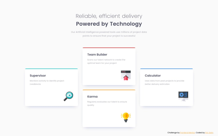
Four card feature section using Gaps within Flexbox. Mobile-first CSS!
Design comparison
Solution retrospective
To date, this was my favorite one. I specifically enjoyed again the mobile-first approach and using gaps with flexbox.
Always open to feedback and improvements, if there are any.
Community feedback
- @tedikoPosted almost 4 years ago
Hello, Eric Salvi! 👋
Good to see you postiong another solution! Your solution responds well and overall looks good. There is nothing to add, good job! See you next time.
Good luck with that, have fun coding! 💪
1 - @AgataLiberskaPosted almost 4 years ago
Hi Eric, nice work on this challenge, it looks great! If you want to add something extra, you could do a two-column layout for tablet as well :)
1@ericsalviPosted almost 4 years ago@AgataLiberska that is a great idea. I tend to forget I can do that even though the challenge doesn’t have that example image.
0
Please log in to post a comment
Log in with GitHubJoin our Discord community
Join thousands of Frontend Mentor community members taking the challenges, sharing resources, helping each other, and chatting about all things front-end!
Join our Discord
