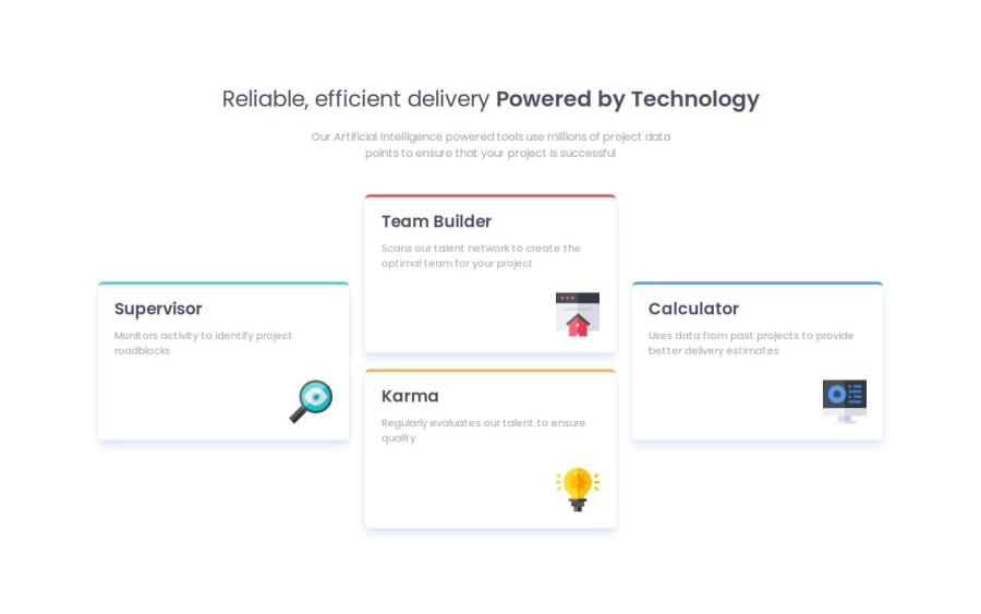
Four Card Feature Section - SCSS, Grid, Flexbox, Responsive


Design comparison

Community feedback
- P@toshirokubotaPosted about 1 month ago
Congratulations on your project. It looks very good. I do not have much feedbacks except a couple minor ones. First, you have the 'box-sizing: border-box;' style setting at multiple places. I always have it under :root so that it becomes default and do not have to set it in other places.
Second, this may be a personal preference, but when you narrow the screen, the layout gets really squashed before it changes to the mobile mode at 478px. You may want to move the breakpoint larger so that it switches to the columnar layout sooner. But if you do so, each card may look very empty. You can change the font-size continuously to minimize such empty look.
Good luck, and keep up the good work!
Marked as helpful0@FernJBatistaPosted about 1 month agoHey @toshirokubota thanks for the feedback! I'll look out for these. I create another style breakpoint FOR 720px and have them as two equal columns before it changes to the single column.
Good luck to you too!
0

Please log in to post a comment
Log in with GitHub
Join our Discord community
Join thousands of Frontend Mentor community members taking the challenges, sharing resources, helping each other, and chatting about all things front-end!
Join our Discord