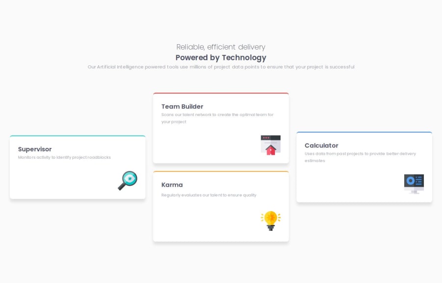
Four card feature section responsive with grid
Design comparison
Solution retrospective
My understanding about how grid layout works. I will change my way of doing my layout.
What challenges did you encounter, and how did you overcome them?How position my left and right containers in the grid. I read all the properties and apply what I learned.
What specific areas of your project would you like help with?Responsive units and media queries.
Community feedback
- @sebamarquesPosted 6 months ago
Hi, you did a really good job, for the solution it's practically the same as the design we were given!!. But reading your html and your css i noticed that you don't use the BEM methodologie, there are a lot but that's the one i'm using right now: https://getbem.com/ and the video of kevin powell:https://www.youtube.com/watch?v=SLjHSVwXYq4 Everything else it's really good, great job
Marked as helpful0
Please log in to post a comment
Log in with GitHubJoin our Discord community
Join thousands of Frontend Mentor community members taking the challenges, sharing resources, helping each other, and chatting about all things front-end!
Join our Discord
