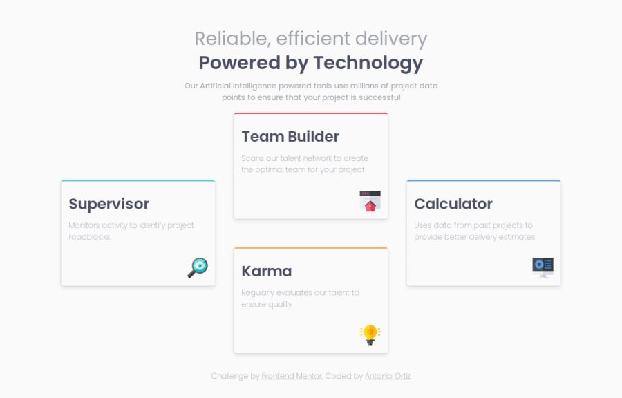
Four card feature section: Postcss, Tailwind tokens, Eleventy
Design comparison
Solution retrospective
Any feedback is appreciated.
My questions:
- Can this be done without using media queries?
- I created a tablet version with two rows and two columns. Is this correct?
- I changed the base font color to a darker shade to improve readability. Is this correct?
Community feedback
- @KapteynUniversePosted 11 days ago
Hey Ortiz, i am not very good at grid, but with it, i think it is possible to do this challenge without media queries. This is what i came up with while thinking about your question (Ofc needs styling and other things).
<body> <main> <div class="first-item"> <h2>Supervisor</h2> <p>Monitors activity to identify project roadblocks.</p> </div> <div class="mid-container"> <div class="second-item"> <h2>Team Builder</h2> <p>Scans our talent network to create the optimal team for your project</p> </div> <div class="third-item"> <h2>Karma</h2> <p>Regularly evaluates our talent to ensure quality</p> </div> </div> <div class="last-item"> <h2>Calculator</h2> <p>Uses data from past projects to provide better delivery estimates</p> </div> </main> </body>
body { min-height: 100dvh; display: flex; flex-direction: column; justify-content: center; } main { display: grid; grid-template-columns: repeat( auto-fit, minmax(250px, 1fr) ); gap: 1rem; align-items: center; } div { background-color: yellowgreen; }
This makes me to want to go back and redo this challenge tbh.
This will make the last item to place in an ugly position between 500-750px screen size tho. There are probably ways to make it nice. One way might be Kevin Powells this video
For the second question:
You did it in the end. The solution looks like the design and responsive. So it is correct. You also added a tablet layout, that is nice too. There are ofc always better and efficent ways to it.
For the last question:
When you hover a text with the select tool on dev tools (ctrl + shift + c on chrome) it shows you to if the contrast is good for accesibility. Additionally if you applied a color to the text and select the text, you can see the css styles on that element under the styles. There, there is a square, it opens a color picker when you click it
h3 { margin-top: 0.2em; color: /* SQUARE HERE */ var(--color-primary); font-weight: var(--font-medium); font-size: var(--size-step-3); }
On that color picker, there is a contrast ratio section, when you click it, it adds 2 curve lines to the color picker. Color should pass that breakpoints. Probable it is but i don't know how reliable this.
You can check W3C and here for better understanding.
Web Dev Simplified has also a video about accesibility
1
Please log in to post a comment
Log in with GitHubJoin our Discord community
Join thousands of Frontend Mentor community members taking the challenges, sharing resources, helping each other, and chatting about all things front-end!
Join our Discord