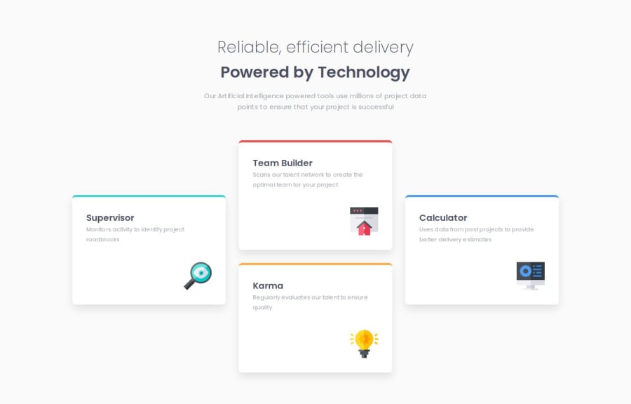
Four card feature section (Using Vite + React, TypeScript, SCSS, BEM)


Design comparison

Community feedback
- @MarziaJaliliPosted 2 months ago
Congratulations on finishing the project!
Some suggestion:
-
Using the
grid-template-areascan be a very concise approach, man. -
In order for this property to work, you are required to set the
grid-areain each testimonial element.
Take the code below as an example for html:
<ul class="feature-parent">
  <li class="feature">(the details of the supervisor)</li>
  <li class="feature">(the details of the team builder)</li>
  <li class="feature">(the details of the karma)</li>
  <li class="feature">(the details of the calculator)</li>
</ul>
Then, apply the code below in css:
/* give each child element a name for grid-area */

.feature:nth-child(1) {
  grid-area: one;
}

.feature:nth-child(2) {
  grid-area: two;
}

.feature:nth-child(3) {
  grid-area: three;
}

.feature:nth-child(4) {
  grid-area: four;
}

.feature:nth-child(5) {
  grid-area: five;
}

/* set the grid-template-areas on the parent element*/

/* for mobile */

.feature-parent {
   display: grid;
   gap: 1rem;
   grid-template-areas:
    "one"
    "two"
    "three"
    "four"
   ;
}

/* for tablate */

@media (min-width: 30em) {
  .feature-parent {
     grid-template-areas:
       "one two"
       "three four"
     ;
  }
}

/* for desktop */

@media (min-width: 60em) {
  .feature-parent {
    grid-template-areas:
      ". two ."
      "one two four"
      "one three four"
      ". three ."
    ;
  }
}
Your solution looks AWESOME though!
I hope I convied my idea properly😁😁
Marked as helpful1P@mykola-pyrohPosted 2 months agoThanks for your comment. I don't think this task requires a grid, it can be done perfectly well with flex. But you suggested something I hadn't thought of, making a breakpoint for tablets. I'll do that in my spare time.
0 -
- @skyv26Posted 2 months ago
Hi @mykola-pyroh,
I can see that you are confused with the media query and that's the reason why your cards are not adapting accordingly, because the media screen you are targeting is <= 375px because you used max-width. Let me know if you want some help specifically using just flex without grid.
0P@mykola-pyrohPosted 2 months agoThank you very much for bringing this to my attention. I didn't catch that the assignment was written about more than one breaking point. I made a small correction, and it looks much better now.
1


Please log in to post a comment
Log in with GitHub
Join our Discord community
Join thousands of Frontend Mentor community members taking the challenges, sharing resources, helping each other, and chatting about all things front-end!
Join our Discord