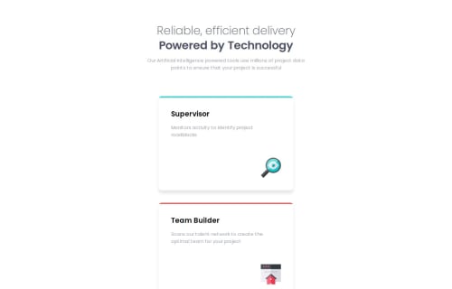
Submitted about 1 year agoA solution to the Four card feature section challenge
four-card-feature-section-master
@isaacsuckling

Solution retrospective
What are you most proud of, and what would you do differently next time?
Figuring out a layout that works with the responsive requirements. Also figuring out how to do the colored top-border on each card by using linear-gradient.
What challenges did you encounter, and how did you overcome them?Figuring out the colored top-borders and having all the cards layout correctly.
What specific areas of your project would you like help with?I want to better learn how to write my css so it is more concise and organised. I feel like i have extra code in there or even incorrect code that can all be cut down and neatened up.
Code
Loading...
Please log in to post a comment
Log in with GitHubCommunity feedback
No feedback yet. Be the first to give feedback on Isaac Suckling's solution.
Join our Discord community
Join thousands of Frontend Mentor community members taking the challenges, sharing resources, helping each other, and chatting about all things front-end!
Join our Discord