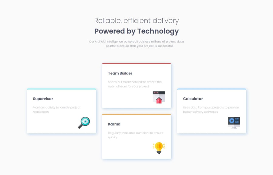
Design comparison
Community feedback
- P@vanrucPosted about 1 month ago
First of all, Congratulation.
Secondly, I would like to have some comment on your solution:
- you are missing design for mobile and tablet versions.
- On your desktop version:
-
One small note: you haven't define font-size for html tag, so it will be set as default 16px, it will affected to your calculation base on rem(like font size, width, gap, padding, margin...)
-
The first-p: Current font size currently is 36.8px, while design is 36px Font weight should be 275 Color is not follow design Line height should be 140%(50.4px) It should have letter-spacing of 0.25px;
-
The second-p: same as first-p, just different from font-weight
-
The desc-p: Color should follow our design: grey color #4D4F62 Line height: 140% And I think we shouldn't use <pre> tag for it, using <p> tag with proper width, padding, margin will be okay.
-
Your card container Display flex is correct But the flex item is a bit hard to control. I suggest some change like below:
a) card container: .container { display: flex; gap: 32px; align-items: center; justify-content: center; }
b) for flex item left and right:
- remove all margin: left, right, auto.
So your card will be more flexible.
The rest of small thing, you may try to do close as design as possible.
Thanks and good luck with your improvement, Ruc
0
Please log in to post a comment
Log in with GitHubJoin our Discord community
Join thousands of Frontend Mentor community members taking the challenges, sharing resources, helping each other, and chatting about all things front-end!
Join our Discord
