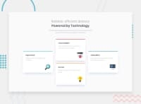
Design comparison
SolutionDesign
Solution retrospective
Any comments are welcome.
Community feedback
- @kens-visualsPosted about 3 years ago
Hey @koniuszko 👋🏻
Everything looks great, I just have a small suggestion for accessibility, the icons, should have
aria-hidden="true”, because they are for decoration only. For example,<img src="./images/icon-supervisor.svg" aria-hidden="true”>. You can read more aboutaria-hiddenhere.I hope this was helpful 👨🏻💻 overall, you did a good job, nicely done. Cheers 👾
Marked as helpful0 - @fidellimPosted about 3 years ago
Hi Mateus,
Great work finishing the project, just a suggestion, you can add this to add color to your top border card
.card:nth-child(3)::before {
    border: 3px solid hsl(34, 97%, 64%);
    background: hsl(34, 97%, 64%);
}
Just add background to all of your cards.
I hope it helps :)
0
Please log in to post a comment
Log in with GitHubJoin our Discord community
Join thousands of Frontend Mentor community members taking the challenges, sharing resources, helping each other, and chatting about all things front-end!
Join our Discord

