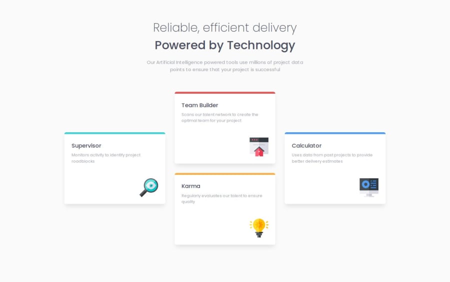
Design comparison
Solution retrospective
I am most proud of the following:
- implementing a mobile first, responsive, CSS grid layout. I feel that it works quite nicely!
- further practicing the usage of Sass in my projects
(also, I added some glowing hover effects to the cards for that extra ✨polish✨. I think it looks really cool, you should check it out should you get the chance! 😎)
What challenges did you encounter, and how did you overcome them?I struggled a bit at first with the grid layout, as I was a bit rusty in implementing it. Nothing that Google couldn't help with, and honestly the implementation was pretty smooth thanks to proper structure ahead of time.
What specific areas of your project would you like help with?I'd love some tips regarding proper semantic html elements. I still struggle in confidently choosing the proper elements for my page structure.
... the sizing isn't perfect on all the elements, but it's close enough (and I don't have pro for the design docs yet 😭) so I'm just going to leave it as is and keep grinding more projects out.
Please log in to post a comment
Log in with GitHubCommunity feedback
- P@juliengDev
Hello Justin 👋,
I've had the pleasure of reviewing your project, and I'm impressed with your efforts! Your implementation shows great promise. I'd like to share some observations that might help enhance your work even further.
Key Strengths:
- You’ve done an excellent job of visually adhering to the design. Don’t worry too much about positioning; without the pro version, it’s very difficult to get it exactly right.
- Great use of animations on hover, which add a nice touch to the user experience.
- Effective use of responsive values like
remfor sizing, which ensures better scalability across devices. - Utilization of variables, for example:
This makes your CSS more maintainable and easier to read.$red: hsl(0, 78%, 62%); $font-stack: Poppins, Arial, Helvetica, sans-serif;
Areas for Growth:
Semantic HTML:
As you requested, here are my thoughts on how this aspect can be improved:
- Try to structure the main sections as direct children of the body, like
<header>,<main>, and<footer>. - Consider replacing
<section class="container-hero">with a<header>element and<section class="card-container">with a<main>element. - You can still use
<section>elements, but wrapping them within these main elements would be beneficial. - I noticed you used the
<h1>element twice. It's best to use a hierarchical order for headings:<h1>,<h2>,<h3>, etc. - Consider using the technique of setting the root font size to 62.5% (
html { font-size: 62.5%; }). This makes it easier to calculateremvalues, as 1rem will equal 10px (e.g., 1.6rem will be 16px). This approach simplifies responsive sizing and improves consistency across your design.
To further improve your code, I recommend checking out the WAVE Web Accessibility Evaluation Tools. They offer a Chrome extension that can be very useful. Additionally, you can review your HTML and CSS code with the Markup Validation Service website.
I also saw that you used an
<img>element for the SVG. There are more appropriate ways to integrate an SVG icon. Feel free to check my code for inspiration if you need.Remember, these are suggestions to help you grow. You're doing great work, and each project is a step forward in your development journey. Keep pushing yourself and exploring new techniques!
I hope you find my feedback valuable. If it was helpful, I'd really appreciate it if you could mark my comment as helpful on the platform. Your feedback helps me improve too! 🌟
Happy coding, and I'm looking forward to seeing your future projects! 💻✨
Join our Discord community
Join thousands of Frontend Mentor community members taking the challenges, sharing resources, helping each other, and chatting about all things front-end!
Join our Discord
