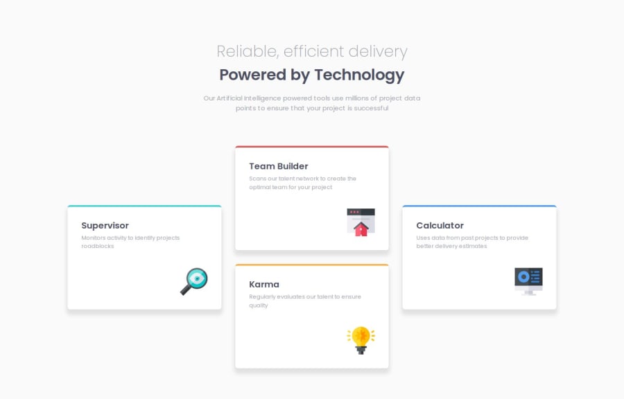
Design comparison
Solution retrospective
I am so proud that the time I spend creating my HTML/CSS is shortening! For my next challenge, I will try to set up a time to finish my layout rather than timing how long it takes! I am also falling in love with using clamp()! It makes it much easier to control the page than do it all individually using media query.
What challenges did you encounter, and how did you overcome them?The challenge I encountered was using box-shadow, especially to make it the left and right shadows lighter than the bottom part of the card. Though, I figured out it can be controlled by using opacity!
What specific areas of your project would you like help with?Total layout of the HTML/CSS. And I am willing to gain help with making my SASS/SCSS much more convenient and cleaner!
Community feedback
- P@Maanlicht91Posted 5 months ago
Congrats completing this challenge. I love using scss for clean and nested code. I see you don't use nested feature of scss. I would recommend you check BEM (Blocks, Elements, Modifiers. Its very useful with scss. Also I will search about clamp now thanks to you I never used it. But looks like is good for responsive typography. Keep working.
Marked as helpful0@mdchongPosted 5 months ago@Maanlicht91 Hi Aynur! Thank you so much for the feedback! I have no idea why I did it this way (probably due to my habit) but I should really try nesting for my next challenge!
0
Please log in to post a comment
Log in with GitHubJoin our Discord community
Join thousands of Frontend Mentor community members taking the challenges, sharing resources, helping each other, and chatting about all things front-end!
Join our Discord
