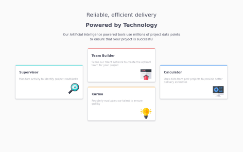
Submitted about 5 years agoA solution to the Four card feature section challenge
Four card feature section
@Greeshma2903

Solution retrospective
I had a problem with aligning the images on the bottom-right of each section. Tried using margin-right 0px, then relative positioning too, but didn't work. would like feedback on that part.
Code
Loading...
Please log in to post a comment
Log in with GitHubCommunity feedback
No feedback yet. Be the first to give feedback on Griselda Knight's solution.
Join our Discord community
Join thousands of Frontend Mentor community members taking the challenges, sharing resources, helping each other, and chatting about all things front-end!
Join our Discord