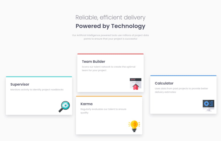
Design comparison
Solution retrospective
I know for sure that my solution isn't the best. please give me some suggestions and help me fix my code and improve. Thank you
Community feedback
- @pikapikamartPosted over 3 years ago
Hey, great work on this one. Key points was already mentioned by @RayaneBengaoui and was really good. My only addition would be that.
At point 1000px going down to the mobile breakpoint, appearance of scrollbar which we really want to avoid. You might want to check that one out. But I think following the above suggestion, you will that issue.
Good work^^
1@EN-MPosted over 3 years ago@pikamart Thank you!
I noticed that scrollbar thing. So, what will you suggest? what can I do?
0@pikapikamartPosted over 3 years ago@EN-M Hey, well it is easy to fix that, just follow Rayane mentioned above. Using some flexbox or maybe grid if you want. Because right now, they are just aligned via the
transform: translate.You want them to flex, not only that, making breakpoints to every dimension where you think the layout is odd or destroyed, or when a scrollbar appears.
I cannot give like a quick fix on that, because we have different way of structuring our code right.
But just using those mentioned above, I think you will achieve that. If you need help after that implementation, just drop it here okay^
1@EN-MPosted over 3 years ago@pikamart Thank you so much for your response!!! would you be kind enough to look at my other challenge too? I need help there too. Sorry if I'm asking too much. here's the link: https://www.frontendmentor.io/solutions/stats-preview-card-component-BBmBcbMj1
0@pikapikamartPosted over 3 years ago@EN-M Sure, but i'll be commenting on that site and not in here okay, so that other can collaborate as well
1 - @RayaneBengaouiPosted over 3 years ago
Hello E.N.M,
Congrats for completing this challenge ! 🙂
I'd like to suggest :
-
To place your boxes, use a display flex or grid instead of trying to position them manually with
transform: translate(). If you use flex, you could flex your section and then have 3 children containers, with the middle containing 2 boxes that hasdisplay: flexwithflex-direction: column. With grid, you could use a 2 rows 3 columns grid and then usetransform: translateY()to put side boxes in the middle. You can look my solution if you are curious about how I did it with flex but I hope this explanation could inspire you. -
I would reduce a little bit the width of the boxes to match better the design.
Overall, well done for the challenge and happy coding ! 😃
1@EN-MPosted over 3 years ago@RayaneBengaoui Thanks for your feedback. I'll make sure to consider them in my revision.
0 -
Please log in to post a comment
Log in with GitHubJoin our Discord community
Join thousands of Frontend Mentor community members taking the challenges, sharing resources, helping each other, and chatting about all things front-end!
Join our Discord
