

Design comparison
SolutionDesign

Solution retrospective
What are you most proud of, and what would you do differently next time?
I did it with flexbox (not with grid) and started using logical units instead of max-width and max-height. I used a mobile-first approach, which saved me a lot of time. I'm happy to follow my learning path and to be with you 🥰.
What specific areas of your project would you like help with?Responsiveness again
Community feedback
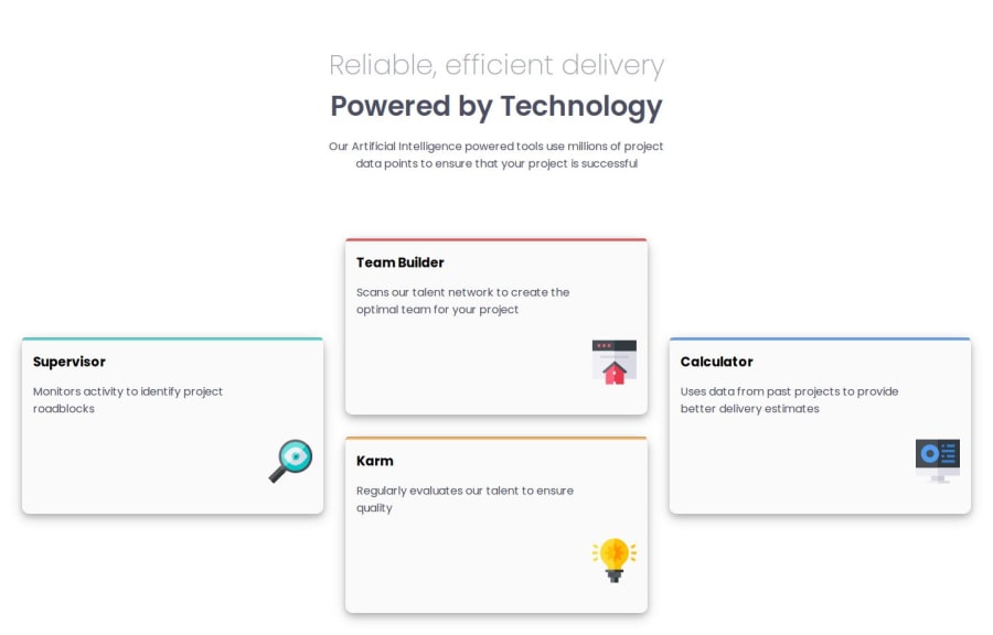
- P@marcus-hillPosted 6 months ago
Hi @Djamel1133, good work with this! I like your use of flex box in order to create the finished design, which works as one of the multiple ways of completing this challenge.
Here's some feedback for you:
- The coloured line at the top of each card appears to have been done differently for the Supervisor card compared to the other three. I would stick to using
border-top:to achieve this (as you have done with the Supervisor card), rather than utilising the<hr>element and then sticking aborder-top:on top, which overlaps with theborder-radius. - The box-shadow doesn't appear to match the design brief, it was specifically looking for one on the bottom of each card.
- It's great you are using responsive CSS units for the margin and font sizes, which scales well with a user's default browser font size.
- Did you need to make each card itself a flexbox (which you've done by targeting
.cards div)? By taking offdisplay: flexon these, the only element out of place is the icon which could then be aligned to the right in another way? The elements in the card are already block elements and so will already stack like a column, questioning whether flexbox was needed.
Good luck in the future!
0 - The coloured line at the top of each card appears to have been done differently for the Supervisor card compared to the other three. I would stick to using

Please log in to post a comment
Log in with GitHubJoin our Discord community
Join thousands of Frontend Mentor community members taking the challenges, sharing resources, helping each other, and chatting about all things front-end!
Join our Discord