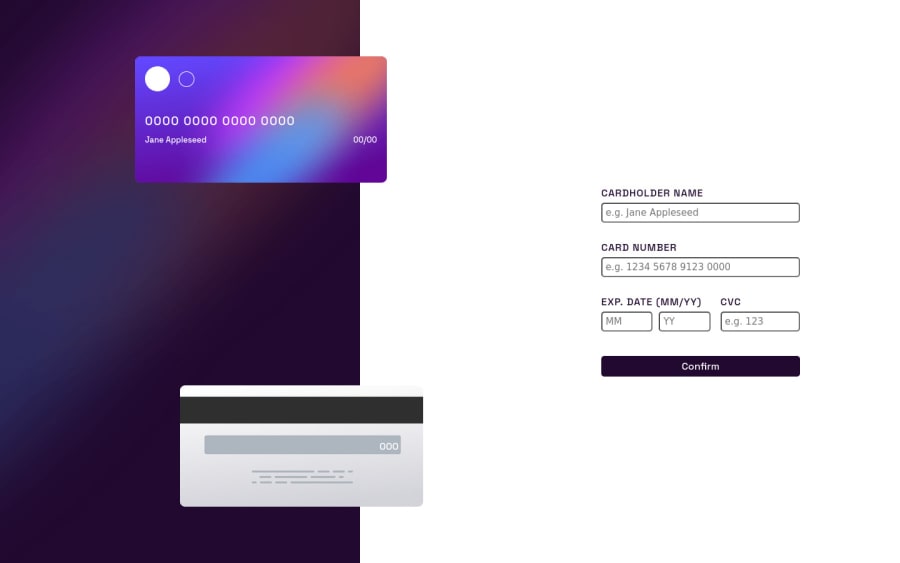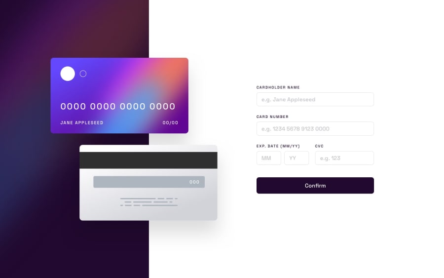
Design comparison
SolutionDesign
Solution retrospective
Hello community,
I have completed another frontend mentor challenge. I found this project quite difficult especially while checking for form validation. I watched Florin Pop's youtube video on form validation while working on this project.➡➡Here is its link Text
I am bit unsure about responsiveness especially on medium sized screen and extra small sized screen. Any suggestions how to optimize my CSS and JavaScript(Using less code). Thank you in advance
Community feedback
Please log in to post a comment
Log in with GitHubJoin our Discord community
Join thousands of Frontend Mentor community members taking the challenges, sharing resources, helping each other, and chatting about all things front-end!
Join our Discord
