Submitted over 3 years ago
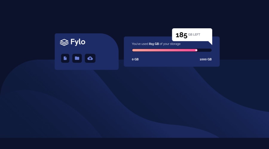
Flyo Data Card using CSS Flexbox & CSS positioning
@Skyz03
Design comparison
SolutionDesign
Solution retrospective
Couldn't make the bottom box in mobile and tab version responsive but updated the solution to make it more better. Any feedback is highly appreciated. Thanks in advance.✌
Community feedback
- @tedikoPosted over 3 years ago
Hello, Sky! 👋
Good job on this one! 🎉 Your solution responds well and overall looks good. Here's my suggestions:
- For your progressbar use just a
divelement with two pseudo-elements since it is not interactive. Givebarckground-colorto this div, and your::afterelement can be a progress (just give it like a 80% width and different background-color) and your::beforeelement can be a circle dot at the end of the bar.
Good luck with that, have fun coding! 💪
1@Skyz03Posted over 3 years ago@tediko Thanks for the great suggestion, need to work a lot on this site bit more and make it perfect. Will surely update this up and let you know. Thanks again. 👍
0 - For your progressbar use just a
- Account deleted
I think you don't need input for progressbar. It's not interactive element.
0
Please log in to post a comment
Log in with GitHubJoin our Discord community
Join thousands of Frontend Mentor community members taking the challenges, sharing resources, helping each other, and chatting about all things front-end!
Join our Discord
