Design comparison
Community feedback
- P@Kiara523Posted 5 months ago
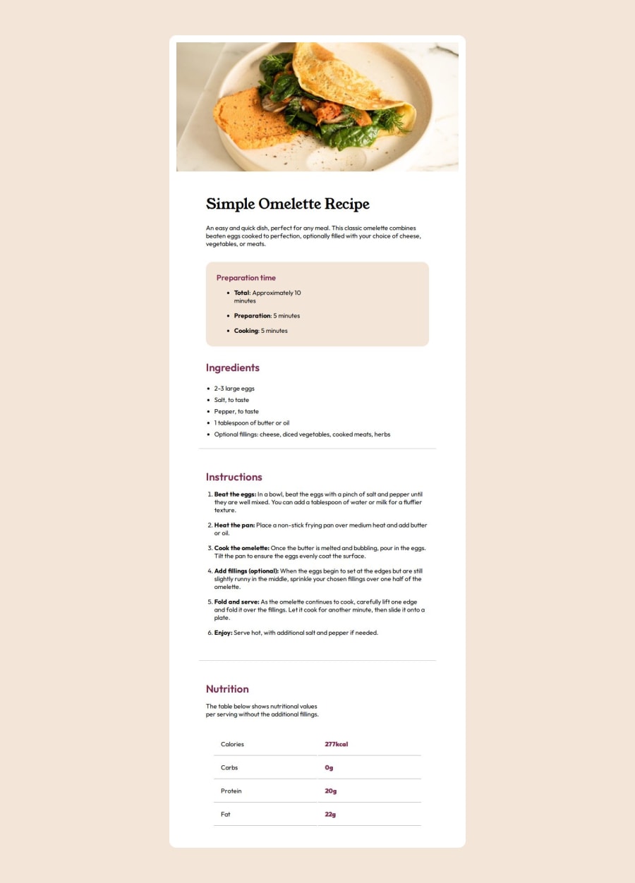
It has some differences from the original design but it looks good and efficient on large screen and also on mobile.
I do have some suggestion to avoid the white space below the image, set the image display:block or inline-block and it will make it disappear.
The html article tag should be used with an article that can stand alone in an other web page and still make sense on his own. It's ok if it is not possible to use all the semantics tags when the content doesn't allowed (lack of headings for example).
Something I use to check the html and CSS file is the w3validator page, it's very useful, for CSS go to: https://jigsaw.w3.org/css-validator/, for html go to: https://validator.w3.org.
0
Please log in to post a comment
Log in with GitHubJoin our Discord community
Join thousands of Frontend Mentor community members taking the challenges, sharing resources, helping each other, and chatting about all things front-end!
Join our Discord
