Design comparison
Solution retrospective
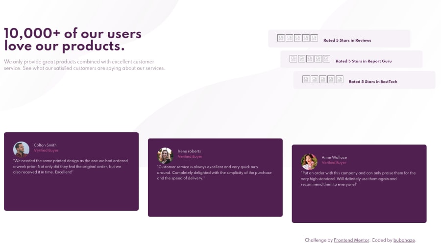
Unfortunately could not see my page on wider screens, hence probably it looks disastrously out there 😬 Any comments, tips & tricks appreciated!
Community feedback
- @Blazing-MikePosted over 3 years ago
Hey Igor... Great attempt you had 🚀🚀 ... Check the file paths for your images also I will advice you to work on mobile screen first... When defining width for elements use the max-width property for the testimonial boxes and ratings as well.
Set some margin and padding for the body and boxes respective for spacing purpose.
Make use of Grid or flexbox for the layout... Anyone you you know better
You can also use this CSS course by Google to refresh a few things https://web.dev/learn/css/
And this in-depth CSS reference https://tympanus.net/codrops/css_reference/
Marked as helpful0@bubahazePosted over 3 years ago@Blazing-Mike thanks a lot for your suggestions, I will figure-out the 'max-width' issue. Also mobile-first approach will be the one I will focus on next challenge :)
There is already grid & flexbox there. Mobile & iPad there is a flexbox, desktop- there is a grid inside a flexbox.
The link you provided seem precious like a gold! Gonna definitely check them out. Peace! ✌🙏
0
Please log in to post a comment
Log in with GitHubJoin our Discord community
Join thousands of Frontend Mentor community members taking the challenges, sharing resources, helping each other, and chatting about all things front-end!
Join our Discord
