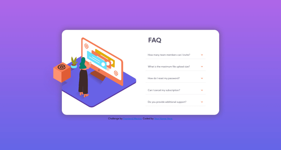
FAQ-accordion-card | Flexbox | BEM | Only Css Accordion
Design comparison
Solution retrospective
thx for the feedback ^^
Community feedback
- @dwhensonPosted over 3 years ago
hey @brkcln nice work on this one! š It looks good, I would just question the use of the radio input elements here, as I'm not sure that's really their intended use, and it could confuse people using assistive tech to view your page.
One thing that really helped me with this one was the use of the details and summary HTML elements. These have much of the functionality baked in and can be styled with a little bit CSS work. This also have the advantage of including keyboard functionality and allow the key elements to be focusable automatically (which is currently missing on your page).
If you went with this approach you can also animate the opening and closing pretty simply using some code like:
details[open] summary ~ * { animation: sweep 0.2s ease-out; will-change: opacity, transform; } @keyframes sweep { 0% { opacity: 0; transform: translateY(-1em); } 100% { opacity: 1; transform: translateY(0); } }
The styling of these elements can seem a bit complicated at first, but there are some good resources out there. The page is a bit of a mess but I have found the following page to be a pretty good guide in how to style things, including the triangle indicator: https://webdesign.tutsplus.com/tutorials/explaining-the-details-and-summary-elements--cms-21999
I have found that if I spend a few extra minutes finding the best HTML element to use this can save me hours of battling things in CSS later on.
Hope this helps!!
Cheers š Dave
Marked as helpful0
Please log in to post a comment
Log in with GitHubJoin our Discord community
Join thousands of Frontend Mentor community members taking the challenges, sharing resources, helping each other, and chatting about all things front-end!
Join our Discord