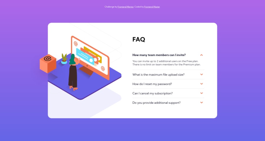
Design comparison
Solution retrospective
Any feedback is welcome
Community feedback
- @anoshaahmedPosted about 3 years ago
To get rid of the accessibility/HTML issues shown in your Report:
- wrap everything in your body in
<main>... OR use semantic tags! .... you can also giverole=""to the direct children of your<body>but that's a little frowned upon... Click here to read more - have at least one
<h1>in your code
Great job Tymur! :)
Marked as helpful0 - wrap everything in your body in
- P@remusbuhaianuPosted about 3 years ago
Congrats on completing the challenge, @tymren608!
I like how you added those little animations to your project. Just a few suggestions for you based on what I've seen in your final solution:
-
On smaller screen sizes, at the bottom of the page, the gradient breaks and there's only a color that shows instead of the entire gradient
-
Also on mobile screens, add more space at the bottom of the .content element
-
On the desktop size of the project, there's a vertical scrollbar on the FAQ elements. You don't need a fixed 300px height and the overflow-y property.
Hope this helps. Keep up the good work!
Marked as helpful0@rsrclabPosted about 3 years agoThank you for your feedback, @Remus432 ~
I will handle the things you have adviced.
0 -
Please log in to post a comment
Log in with GitHubJoin our Discord community
Join thousands of Frontend Mentor community members taking the challenges, sharing resources, helping each other, and chatting about all things front-end!
Join our Discord
