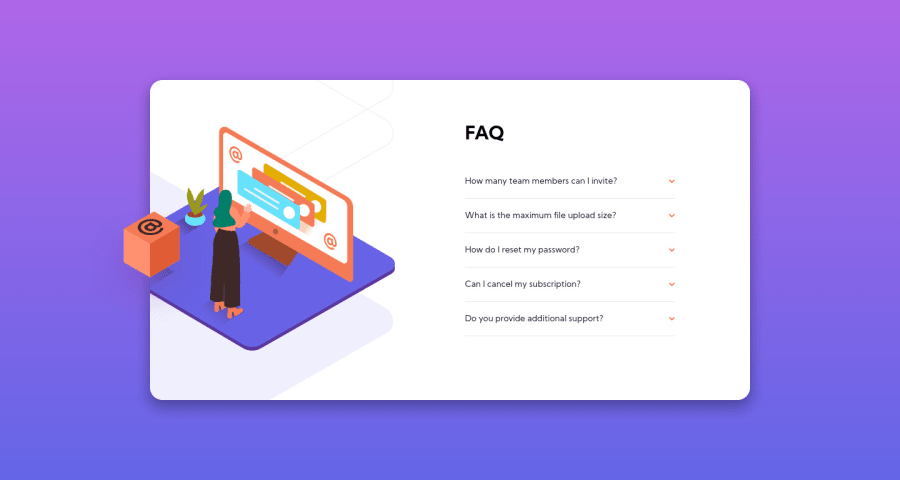
Design comparison
Solution retrospective
Any feedback is welcome
Community feedback
- @tedikoPosted almost 4 years ago
Hello, Nikita! 👋
Good effort on this challenge! In addition to palgramming feedback I would suggest you to make your solution more responsive. Now your
.cardcontainer behaves good only on mobile where you put width on it, and then on desktop. Instead, try to apply somemax-widthon yourcardand also keepwidth: 100%, and set your.card-box-containerto takewidth: 100%and add somepadding: 12pxto prevent sticking to border. Later on you have to make your content within to taking for example 80% of width so it doesn't stay small across screen sizes. - Use Responsive Design Mode to see how your website behaves on different devices. To toggle it pressCTRL+SHIFT+Mon Firefox, andCTRL+SHIFT+Con Chrome.Good luck with that, have fun coding! 💪
1 - P@palgrammingPosted almost 4 years ago
I think you are very close but at 1000px wide you have the orange box outside the browser window so you need probably a little more margin around your main container
1
Please log in to post a comment
Log in with GitHubJoin our Discord community
Join thousands of Frontend Mentor community members taking the challenges, sharing resources, helping each other, and chatting about all things front-end!
Join our Discord
