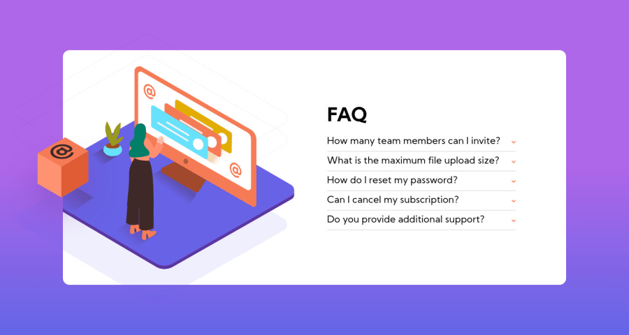
Design comparison
Solution retrospective
Suggestions & Criticisms are Highly Appreciated ❤️️
Community feedback
- @ApplePieGiraffePosted about 4 years ago
Hey, good job once again, Joy Shaheb! 👍
Your accordion card works quite well! 🙌
I only suggest,
- Giving the accordion card a fixed height in the mobile layout so that it doesn't stretch too much (and leave a lot of empty white space inside it) on some mobile screens.
Keep coding (and happy coding, too)! 😁
1 - @tedikoPosted about 4 years ago
Hello, Joy Shaheb! 👋
Congratulations on finishing this challenge. Your website is responsive I i don't find major problems. Good job! What I can suggest is:
-
Try not to repeat your HTML code with
.iconimage for each arrow. Easier way around is to use pseudo element::beforeon your.acordionelement. Set it toposition: relativeand your pseudo element asposition: absolute. Put your image usingcontent: url(image.jpg). -
Maybe add more padding on
.accordionand changefont-sizeto avoid squeeze in faq.
Good luck with that, have fun coding! 💪
1@JoyShahebPosted about 4 years ago@tediko Thank you for the feedback. I really appreciate your Help ^_^
0 -
Please log in to post a comment
Log in with GitHubJoin our Discord community
Join thousands of Frontend Mentor community members taking the challenges, sharing resources, helping each other, and chatting about all things front-end!
Join our Discord
