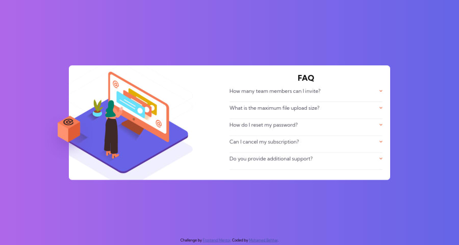
Design comparison
Solution retrospective
Hy developers, hope you all are doing well, this my solution for The Accordion FAQ challenge, i struggled to make the accordion close when Im clicking on another question, I'll be grateful if someone can help me with that.
Community feedback
- @MohamedBehharPosted almost 3 years ago
Thank you very very much for this explicit comment, i'll do my best to make my works looks better.
0 - @skyv26Posted almost 3 years ago
Hi! Mohamed, I just checked you work and also tested mobile responsiveness. I noticed some issues that I am going to write and will try to add some suggestions or tips for betterment of your solution.
- Your Card is too wide and I noticed that you have applied condition, if user only click on the arrows then and only then the accordian tab will open.
You have to keep in mind most probably any user will try to click on the accordian tab's question not directly on arrow. So add this condition too,so that if any click event occurs on the accordian question then it also work same as that of arrow.
- I saw that for the very first time I clicked on question and the tabs expands with it answer's height, but along with this accordian height also changed with expansion of accordian tab and it should not be like this.
Add the fix height for accordian so that it never expand and still at its right position. Also you please on click of any accordian tab, only current tab expand and rest of all should be in collpased state. Because it is the requirement of this challenge, you have to follow the requirement.
-
Your design is responsive but because of above problems it makes it overflowed. You can also check this.
-
For solving your accessibility issue, you have to wrap your .card and .attribution div inside the main tag and from now on use this tag as your container in next challenge's solution.
-
I saw that you haven't enter alt text, so it is good practice to add alt text in your img tag so that any user if comes to your website and any how he/she not able to see the page images then alt text will help to make them understand about the image.
Overall Good work, and I hope you understand above issues.
Good Luck
0
Please log in to post a comment
Log in with GitHubJoin our Discord community
Join thousands of Frontend Mentor community members taking the challenges, sharing resources, helping each other, and chatting about all things front-end!
Join our Discord
