Design comparison
SolutionDesign
Community feedback
- @Alexandru736Posted 7 months ago
Hi @mohammadfallah7
I have two remarks on your solution:
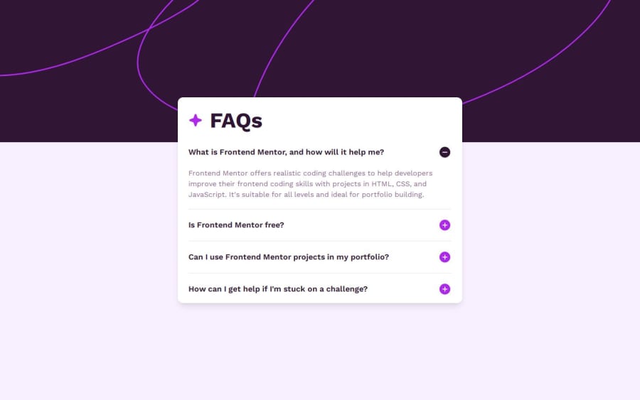
- First, regarding your background-image, for larger screens, it doesn't fully stretches the screen width. For the
<body>tag, you could set the 'background-image: url('your-image')' and thebackground-size: contain. It might not stretches the ideal way, but at least it does the trick. - Secondly, you have overloaded your js script. Ideally, make your HTML with all attributes and elements you need. For example, you could have added both buttons for each question and set the default one with
display: blockand the other one withdisplay: none. Then, instead of creating anactivetype of class, you could have used ARIA attributes likearia-hidden="true"and when you click the button, the attribute of the default button would have the value true and the other one false, and so on. Overall, great project and good job on using SCSS. Keep up the good work!
Best, Alex
0 - First, regarding your background-image, for larger screens, it doesn't fully stretches the screen width. For the
Please log in to post a comment
Log in with GitHubJoin our Discord community
Join thousands of Frontend Mentor community members taking the challenges, sharing resources, helping each other, and chatting about all things front-end!
Join our Discord
