Design comparison
SolutionDesign
Community feedback
- P@tarasisPosted over 2 years ago
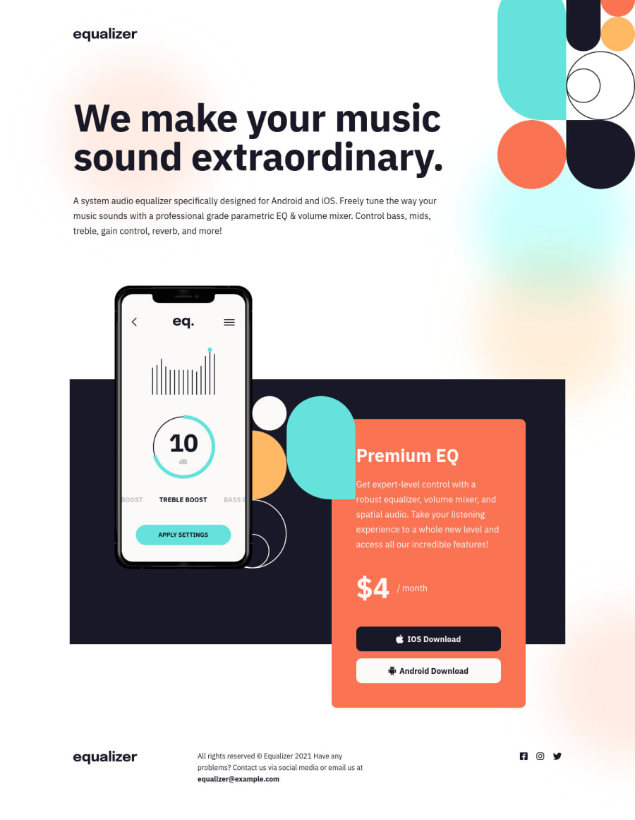
Hey congrats on finishing the challenge. There are some issues, particularly in the between sizes.
- Add
aria-labels to the social links so that a screenreader will read out what the links are for. Particularly regarding the social links. - On tablet size (768x1024) the top right image is over the header text, and that continues to be the case until it swaps to the mobile version.
- Below about 560px to mobile version, the social icons go off the side of the page, causing horizontal scrolling. You would be better staying with mobile version till after that point.
- Between tablet and desktop sizing the red profile card goes behind the image.(in Safari). The problem here is that the
.offer-price-boxhas a z-index of 0 after800px. You setz-index: 3in the media query uptomax-width: 50rem. - Don't just support
:hover, also add:focus, you could do.ios-btn:where(:focus, :hover)that way someone using the keyboard to navigate around the page gets the effect too. - Little thing, but there should be a
<br>after the year in the footer. - Don't use empty
alts for images (on patterns, logos). Add a description, and it you feel its not an important thing for not sighted people, then usearia-hiddenon them. - You used the
appleclass for both the apple and android svgs.
Hope this was of some help to you.
Marked as helpful0 - Add
Please log in to post a comment
Log in with GitHubJoin our Discord community
Join thousands of Frontend Mentor community members taking the challenges, sharing resources, helping each other, and chatting about all things front-end!
Join our Discord
