
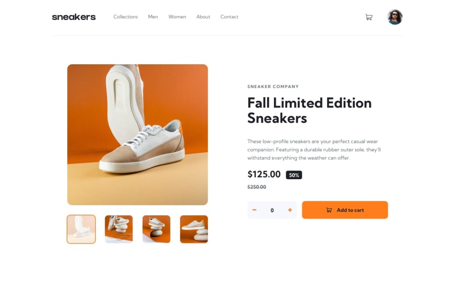
E-commerce product page with Local Storage


Design comparison
Solution retrospective
This one took me much more time that I expected, it was the first time I use a carousel along with a lightbox.
I think it looks good but I'd appreciate any tips/ideas for I could improve or change
Community feedback
- @AyoubrabiaePosted about 1 year ago
Hi Jorge,
I've reviewed your code and the preview, and I must say you're doing an excellent job. I really appreciate the clever tricks you've implemented, like hiding the "Add to Cart" button when the count is less than 1.
However, I noticed some areas in the styling that could use some improvement:
- On larger screens, the layout doesn't look as good as it could. To enhance this, you can wrap your entire app in a container, like a
divorsection, with the class "container." This container should be made responsive for all screen sizes. You can achieve this with the following CSS:
.container { padding: 0 15px; margin: 0 auto; } @media (min-width: 768px) { .container { width: 750px; } } @media (min-width: 992px) { .container { width: 970px; } }- When hovering over the navigation menu links, the orange border appears too abruptly. You can enhance the user experience by adding a transition to make the change smoother.
Overall, your work is great, and these adjustments should further improve the user interface and experience. Keep up the good work!
Marked as helpful1@Jorge-sanchez09Posted about 1 year ago@Ayoubrabiae Thanks for the help! I'll keep that in mind
1 - On larger screens, the layout doesn't look as good as it could. To enhance this, you can wrap your entire app in a container, like a

Please log in to post a comment
Log in with GitHubJoin our Discord community
Join thousands of Frontend Mentor community members taking the challenges, sharing resources, helping each other, and chatting about all things front-end!
Join our Discord