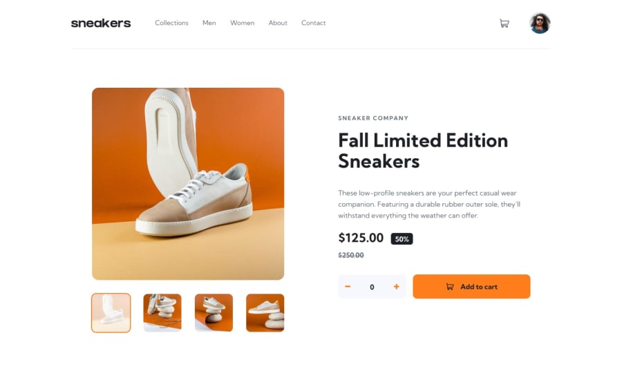
ecommerce product page with html ,css and javascript
Design comparison
Solution retrospective
The challenge was great !.
I have only one issue with hover bottom border in ul !
there is a big gap between the nav border and the ul border I have tried by remove the the bottom paddings for all element but still there is a gap!
I think maybe because the box-sizing, I gonna see it later .
thank you for reading this comment!
Community feedback
- @skyv26Posted almost 3 years ago
Hi! There are some issues.
-
When I try to add quantity into my cart, suppose I entered 5 quantity, then instead of adding 5 more it only add 1 quantity.
-
In Mobile view your corousal is going outside the viewport.
-
In Mobile view black overlay not taking complete width and the cart little quantity circle also moves right and left on menu hide and show.
-
Text is too small to read data.
Too many other issues are there, please fix them all.
Good Luck !
0 -
Please log in to post a comment
Log in with GitHubJoin our Discord community
Join thousands of Frontend Mentor community members taking the challenges, sharing resources, helping each other, and chatting about all things front-end!
Join our Discord
