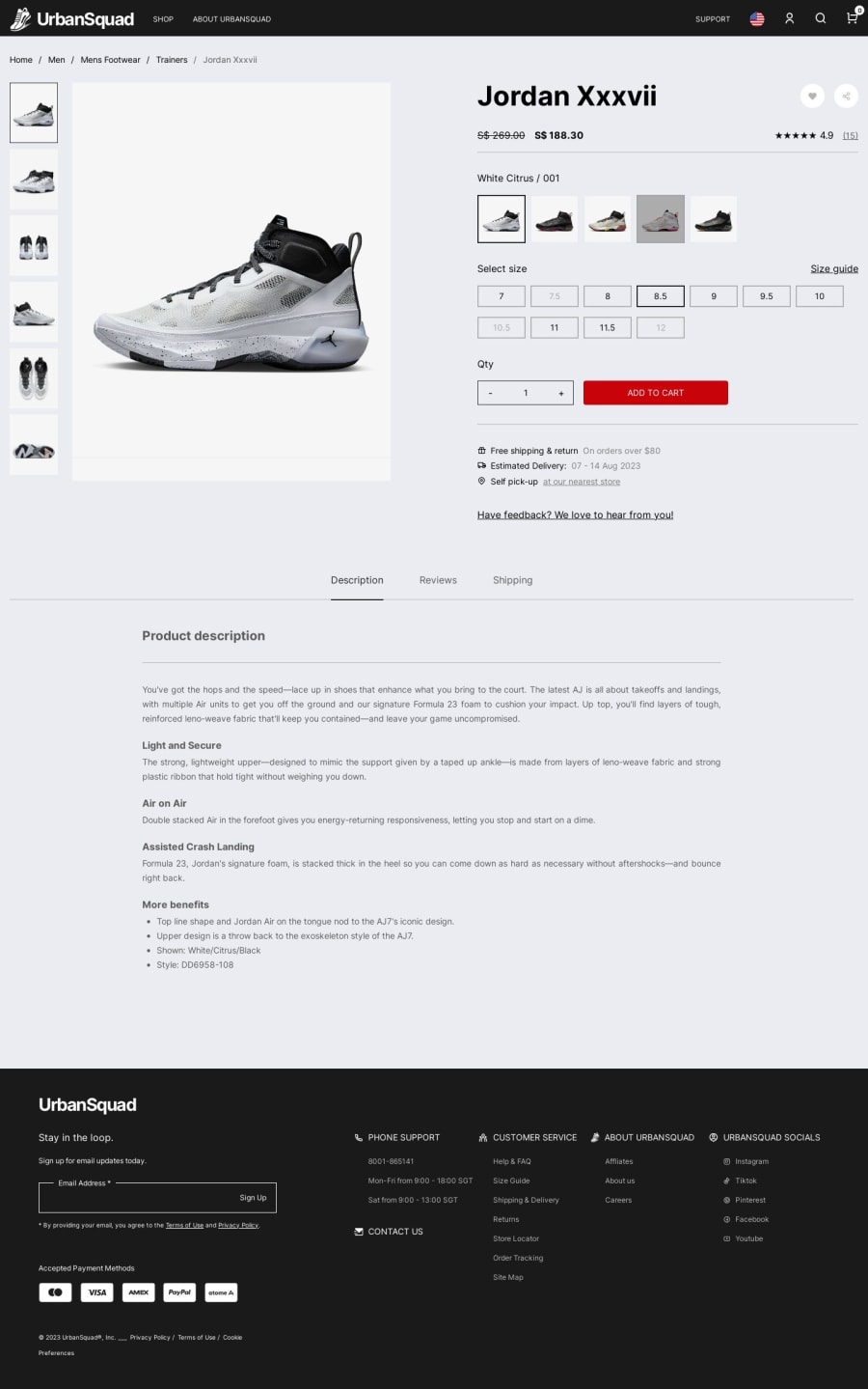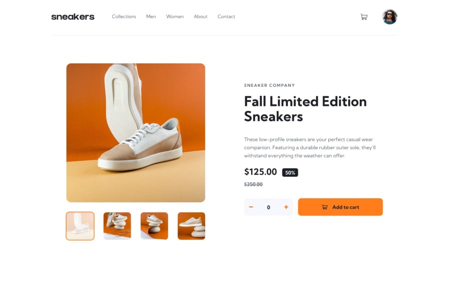
Design comparison
Solution retrospective
Submitted my 30th challenge! This is one of my major design overhaul attempts in Frontend Mentor. While it is far from a working full-stack e-commerce app, I really spent quite an amount of effort to make the product page look as close as possible to commercial standards - with a header, footer, etc. There are also some additional elements like the review section.
The design inspiration, pictures, and even written content are taken from various existing commercial websites like Nike, Under Armour, Skullcandy, and Unsplash.
Meanwhile, also marks one of my last challenges using vanilla JS. I realize a vanilla JS-based code gets more complex and inefficient to maintain as the project grows bigger and more complex. So, I am learning React and backend stuff and hopefully, come back with better stuff.
Community feedback
- @florianstancioiuPosted almost 2 years ago
Well done, the new design looks fantastic!
Great work, I'm speechless!
2
Please log in to post a comment
Log in with GitHubJoin our Discord community
Join thousands of Frontend Mentor community members taking the challenges, sharing resources, helping each other, and chatting about all things front-end!
Join our Discord
