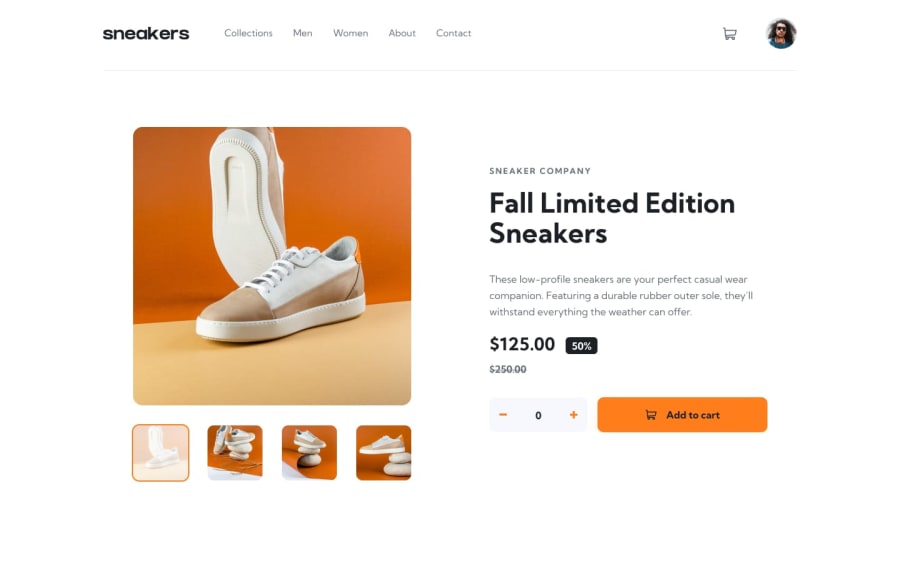
E-Commerce Page using Tailwind and vanilla HTML/CSS/JS
Design comparison
Solution retrospective
This is my first time using tailwindcss - if you find any bugs please let me know!
This challenge was also my first time building a lightbox element and was a much larger challenge than expected. Since it's a very HTML/CSS-focussed challenge, I'm particularly interested in any semantic HTML feedback and suggested improvements you have.
Community feedback
- @ApplePieGiraffePosted about 3 years ago
Hey, James! 👋
This looks really nice! 😀I think you've nailed the design of this challenge and your solution responds very well! 👍
Your HTML also looks great! The only thing I might consider is turning the navigation links in the mobile and desktop menus into an unordered list (since they are a list of links), and then still having the
navtag wrap around them to show that they are part of the website's navigation, of course. 😉Keep coding (and happy coding, too)! 😄
Marked as helpful5 - @sivakotariPosted about 3 years ago
Hi, James
It looks so clean and works as it should be! Not found any issues. Great work! 👍
Marked as helpful1
Please log in to post a comment
Log in with GitHubJoin our Discord community
Join thousands of Frontend Mentor community members taking the challenges, sharing resources, helping each other, and chatting about all things front-end!
Join our Discord
