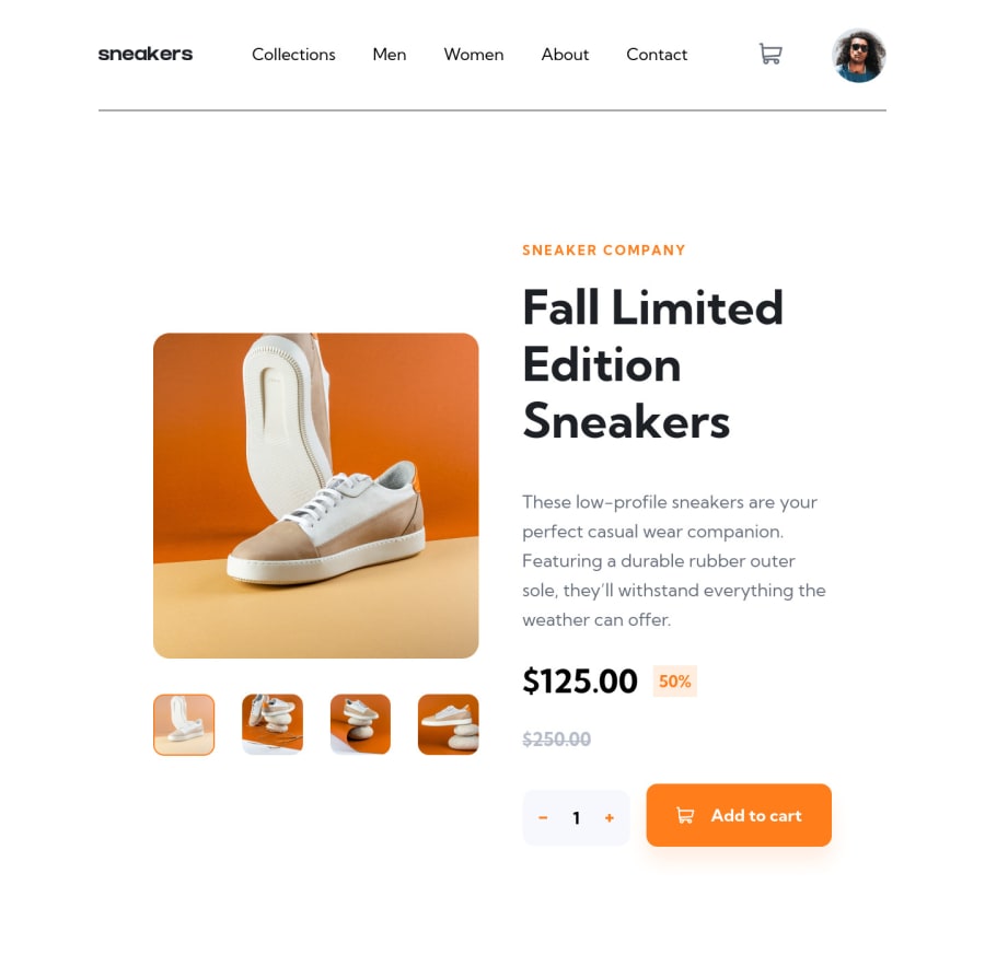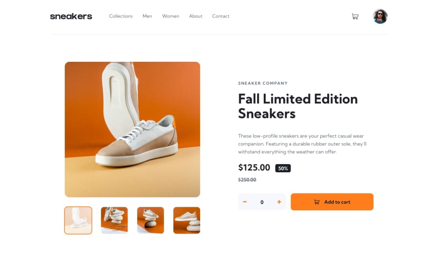
Design comparison
Solution retrospective
I decided to use sass and found out its very easy to use for projects like this sass allows nesting and importation of different scss files into one so it makes it easy to partition website sections. Also followed through MRZ.Code.Manufacture on youtube it was a long one. But yes i finished it. Ill love feedbacks on better ways it could have been done.
Thanks
Please log in to post a comment
Log in with GitHubCommunity feedback
- @Foued80
hi, geat work.
on desktop view when hovering over navbar links i can see the border-bottom shifting due to the boxsizing property, you can fix this by adding margin-bottom:-3.5px;
header .logo .menu ul a:hover { color: #1d2025; text-decoration: none; font-weight: 700; border-bottom: 3.5px solid #ff7d1a; margin-bottom:-3.5px; }
and to prevent the links to shift right when hover over due to the font weight change, try to change opacity or color unstead.
cheers
Marked as helpful
Join our Discord community
Join thousands of Frontend Mentor community members taking the challenges, sharing resources, helping each other, and chatting about all things front-end!
Join our Discord
