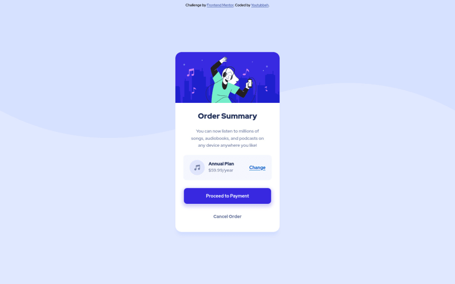
Design comparison
Solution retrospective
I feel like there might be excess divs and excess code in general. Is there any way I can make the code simpler, with the same results?
Thanks!
Community feedback
- @PhantomOzPosted over 2 years ago
Hello Youtubbeh, fantastic job by the way.
I noticed you tried writing semantically good job. Few things I will suggest:
- You change the section element class "plan" to a div - this will make your code more semantic and fix the HTML issue you have, and also you can't have a section element without a heading element.
- To fix your Accessibility issue, you should put the div with class attribution in a footer element or in the main element.
- Also I think you should try to make it responsive for mobile devices using @media-queries in CSS.
I hope this feedback was helpful 👍
Marked as helpful0 - @youtubbehPosted over 2 years ago
Thanks Favour! About making it responsive, I don't think I need to because the main element is smaller than a phone screen, centered vertically and horizontally, and positioned as absolute, so it will always fit. Although I haven't tried it on a horizontal mobile device. Is it best practice to always use @media-queries in CSS regardless of this? Let's say, as a caution measure.
0
Please log in to post a comment
Log in with GitHubJoin our Discord community
Join thousands of Frontend Mentor community members taking the challenges, sharing resources, helping each other, and chatting about all things front-end!
Join our Discord
