Easybank landing page with vanilla stuff
Design comparison
Solution retrospective
Hey guys,
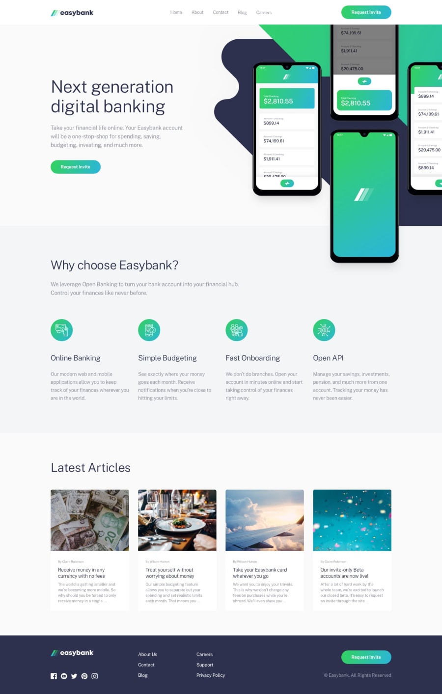
This challenge turned out to be a lot harder than it seemed at first glance! Lots of layout and accessibility problems I had to solve but I learned heaps and really had fun completing this project.
Inspired by Kevin Powell's recent video, I added a Skip navigation button as well.
I'd be very happy to hear some feedbacks (especially regarding accessibility and HTML)! Was also wondering, if I should add animations to the page but then decided against it as I kinda like the clean looks of the design (also unsure how much animation a banking app should have^^). What do you think?
Community feedback
- @zenStrokePosted almost 3 years ago
Hi FluffyKas,
Great job on completing the challenge!
I had a look at the live version of your site and overall, I think you did great. There were a few minor issues.
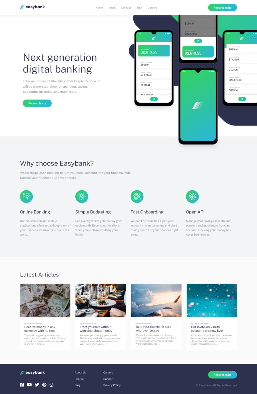
I assume it looks fine on your monitor, but on my 13 inch macbook it seems like there are some scaling/responsiveness issues. The request invite button under 'Next Generation Digital Banking' actually goes below the grey part and enters the next section. Sadly, I am not well-versed in responsive design yet and cannot give you tips on how to improve this.
Similarly, the mockup image overflows to the right. I think this can be fixed if you add overflow: hidden; to the parent element of the image.
Other than that, you managed well! I did the same challenge, and it took around 4 days to complete. If you don't mind, I would appreciate it if you could have a look at my site from your perspective and provide me with some feedback. (note: I haven't optimized for mobile yet)
Also, if you would like, I can send you a screenshot of what I see in my screen of your site in the slack channel if you are in there.
0@FluffyKasPosted almost 3 years ago@zenStroke I'm aware the overflow, unfortunately the solution to this is a lot more complicated then an
overflow: hidden. :( I'm yet to come up with a better solution. That first hero section is giving me some real trouble :DThank you for the feedback though, I appreciate the time you took to look at it! I'll revisit this challenge later when I have a better idea on how to fix this issue. Things like this is the reason I still have a love-hate relationship with CSS :D
I already commented on your solution and gave some feedback on it ^^
0@abedfetratPosted almost 3 years ago@FluffyKas Recently completed this challenge. You can use
overflow-x: clipto fix the overflow issue. Basically it's the same as overflow: hidden but this also disables all scrolling on that element. You might need to use it on your whole hero container.By the way thanks to your solution now I know to use transform: translateY on the hero graphics to offset it instead of using absolute positioning. I had problems that when the graphics scaled up the content below didn't get pushed down accordingly. :thumbsup:
Marked as helpful0@FluffyKasPosted almost 3 years ago@abedfetrat I was trying to make it work with
overflow-x: hiddenbut that just didn't work. Never tried clip though so I'm excited to see if this really works! I give it a go tomorrow, thank you so much!And I'm happy I was able to help you, too. I started out using absolute positioning but changed it as I was running into problems as well ^^ What a tricky little challenge :D
1
Please log in to post a comment
Log in with GitHubJoin our Discord community
Join thousands of Frontend Mentor community members taking the challenges, sharing resources, helping each other, and chatting about all things front-end!
Join our Discord
