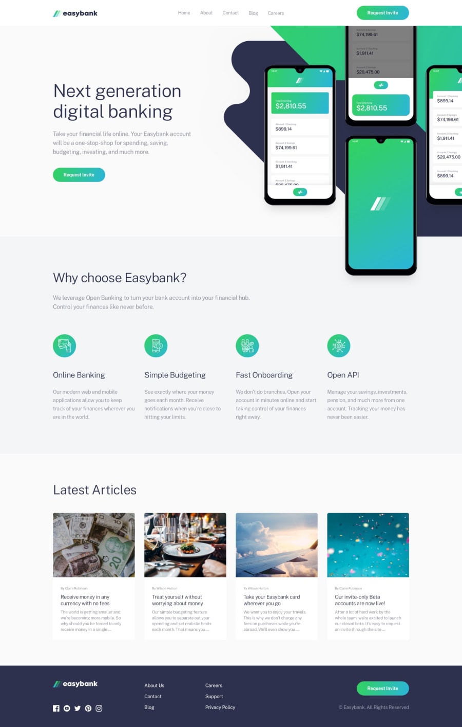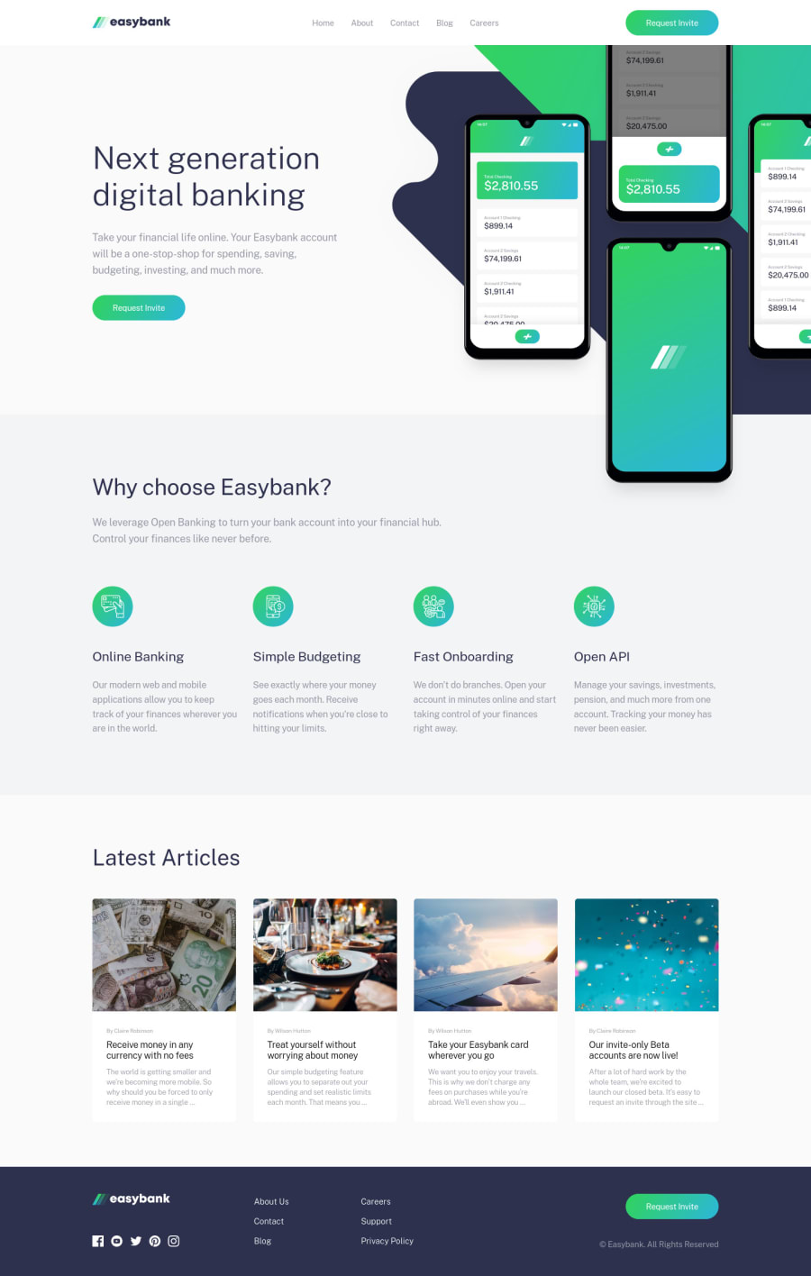
Easybank landing page with CSS Grid
Design comparison
Solution retrospective
Hi all ๐
I decided to do this challenge with SASS, CSS Grid, Flexbox, BEM and a little animations.
Bonus:
- Grid Tracks names for layout.
- Mobile nav only with CSS.
- JS only to hide scroll when mobile navigation is open.
- Background sections using css grid positioning only for testing purpose.
Any feedback is appreciated.
Happy coding ๐.
Community feedback
- @ApplePieGiraffePosted almost 4 years ago
Hello, Jesรบs Alejandro Atao! ๐
It's great to see you completing so many challenges! ๐ Well done on this one! ๐ Your solution looks great and responds nicely! I also really like the hover states of the navigation links in the header of the page and the transition of the mobile navigation! ๐
A super tiny suggestion might be to add
cursor: pointer
to the "Request Invite" button in the hero section of the page. ๐As always, keep coding (and happy coding, too)! ๐
1@JesusAtao96Posted almost 4 years agoHello @ApplePieGiraffe ๐
Thanks for the comment ๐, I just updated the project.
Happy coding, too! ๐
1@ApplePieGiraffePosted almost 4 years ago@JesusAtao96
Awesome, looks good! ๐
1 - @mattstuddertPosted almost 4 years ago
Awesome work on this challenge, Jesรบs!! Your solution looks amazing and scales down really well to mobile!
Interested to hear more about your thoughts around the empty
div
elements for the background styles. Could you go into that in more detail, please?You've been posting some awesome solutions. Keep up the great work!
1@JesusAtao96Posted almost 4 years agoHi @mattstuddert ๐
In this challenge i try to do something different ๐ฅ, use the power of the grid to have the content centered and divided.
The empty divs to give the full background to the sections is something strange but I wanted to do it that way and not the usual thing that is to have a parent div with the full width and a child div with a specific width centered with
margin: 0 auto
or using flexbox ๐ .The empty divs are accompanied by their sections in the same position on the grid, the full width is specified by the names I gave to the tracks [full-start] / [full-end], and the height is automatically adjusted to the content from the section.
I loved the result and if I can think of a different and strange way to do it, you will know it in the next challenges ๐.
1@mattstuddertPosted almost 4 years ago@JesusAtao96 nice to see you trying different techniques and experimenting. That's exactly what these challenges are for! ๐
Looking forward to seeing your next solution ๐
1 - @SeyideHundeyinPosted almost 4 years ago
This is very nice and it matches the design perfectly.
Happy coding!!
1
Please log in to post a comment
Log in with GitHubJoin our Discord community
Join thousands of Frontend Mentor community members taking the challenges, sharing resources, helping each other, and chatting about all things front-end!
Join our Discord