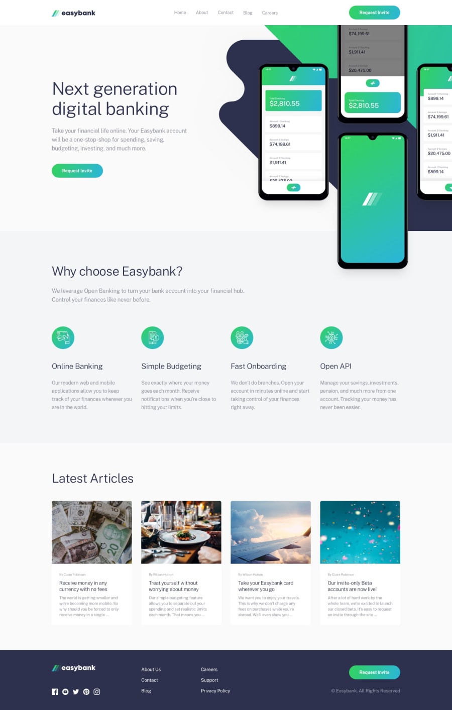
Design comparison
SolutionDesign
Solution retrospective
Hello,
I compleated this challenge with Bootstrap and I have some problems with width on smaller devices. I used Bootstrap width such as w-75, but it doesn't work on smaller devices. Would be grateful if someone can suggest to me how to fix that. Thanks in advance.
Community feedback
- @tedikoPosted over 3 years ago
Hello, NPelivan! 👋
You did great on this challenge. Here's my few tips:
- Add
:focuspseudo class to interactive elements like anchors, buttons etc. Useoutlineproperty to make your website more accessible to keyboard users. Focusable elements like anchor, buttons or inputs they have applied default:focuspseudo class withoutlineproperty. These default styles are subtle and hardly visible tho. Furthermore every browser has a slightly different default style for the outline, so you probably want to change the default style. Read more about why we should change focus styles. - Since your
.logoimage is decorative youralttext should be provided empty (alt="") so that they can be ignored by assistive technologies, such as screen readers. - You forgot to wrap your
.social-containericons in anchor tags. Have fun coding! 💪
1 - Add
Please log in to post a comment
Log in with GitHubJoin our Discord community
Join thousands of Frontend Mentor community members taking the challenges, sharing resources, helping each other, and chatting about all things front-end!
Join our Discord
