
Design comparison
Solution retrospective
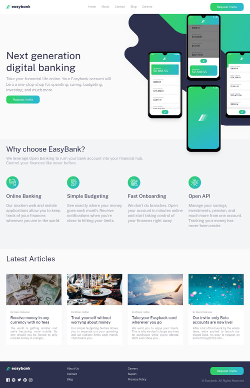
It was a little bit difficult to style the images of the hero component, but i think i finally got it. ¿Any suggestion / feedback 😁?
Used technologies:
- Typescript
- React
- CSS modules
- Vite
Please log in to post a comment
Log in with GitHubCommunity feedback
- @catherineisonline
Looks great. You also might need to add cursor: pointer for your hamburger icon 🙌🏻
- @JaneMoroz
Hey! Your solution to this challenge is great! 👍
The only thing I've noticed:
- You need to wrap the main content of the page into the <main> tag. It will solve all these landmark issues and improve accessibility.
Keep it up! And good luck 🍀
- @godmayhem7
hey @PChaparro your code was absolutely amazing you did well using multiple frame works👏👏, but there was just something you didnt do well i checked out your solution on mobile view i found out that some of your elements was over your button and it made your website look kinda weird, i am sure that you must have forgotten to debug your code judging from the appearance of your website. i always advise people to at least try and debug their codes after committing their files to their repository this helps out in a lot of ways. this is a helpful tool to us as a developer, the rest of your code was okay 👌👌, hope this feedback was helpful 👍👍
Join our Discord community
Join thousands of Frontend Mentor community members taking the challenges, sharing resources, helping each other, and chatting about all things front-end!
Join our Discord