Submitted over 2 years agoA solution to the Digital bank landing page challenge
Easybank Landing Page
@Khawarmehfooz

Solution retrospective
Hi frontendmentor Community! 👋
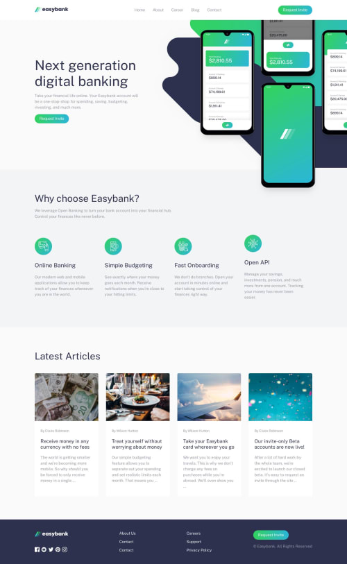
I'm excited to share my first commit for the Easybank landing page challenge.🚀I've run into a couple of issues and I need help.
-
Firstly, I'm struggling to place the hero image below the navbar. Any tips or suggestions on how to achieve this would be really appreciated!
-
Secondly, I'm having trouble with the background pattern in the hero section.
Thank you in advance for taking the time to review my work. Let's make this landing page shine together! ✨
Code
Loading...
Please log in to post a comment
Log in with GitHubCommunity feedback
No feedback yet. Be the first to give feedback on Khawar Mehfooz's solution.
Join our Discord community
Join thousands of Frontend Mentor community members taking the challenges, sharing resources, helping each other, and chatting about all things front-end!
Join our Discord