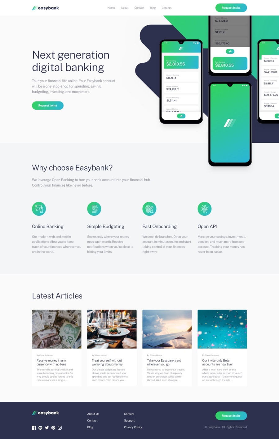
Design comparison
SolutionDesign
Solution retrospective
any feedback is greatly appreciated
Community feedback
- @Dharmik48Posted about 3 years ago
Hey 👋,
I think there's an issue with the navigation menu, if the nav menu is open in small screen and I increase the screen the size the menu just stays there instead of being hidden. Also the position of the mobiles image doesn't seem right, maybe add a
position: relativeto the parent and use thetopandrightproperties to align it better.Marked as helpful0
Please log in to post a comment
Log in with GitHubJoin our Discord community
Join thousands of Frontend Mentor community members taking the challenges, sharing resources, helping each other, and chatting about all things front-end!
Join our Discord
