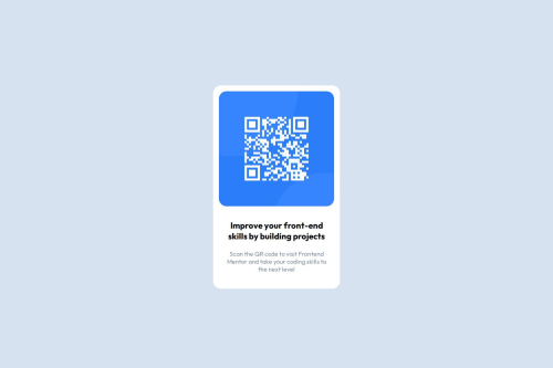
div container , card, card-image , google fonts

Solution retrospective
Successfully replicating the design specifications from the provided mockup, ensuring that the QR code card looks exactly as intended. Implementing a responsive layout so the card looks good on various screen sizes, maintaining usability and visual appeal. I’d focus more on optimizing the performance, perhaps by reducing image sizes or minimizing the number of reflows and repaints in the browser. Incorporating user feedback into the design process, perhaps by conducting usability tests or gathering input from real users to improve the card’s functionality and design.
What challenges did you encounter, and how did you overcome them?Translating the design specifications into code accurately, especially with precise spacing, typography, and colors. Ensuring that the card looks good on different screen sizes and orientations. Making sure the component works consistently across different browsers. I cross-referenced the design with browser developer tools to ensure accuracy and made iterative adjustments. I tested the card on various devices and screen sizes to fine-tune the responsive behavior. I used browser developer tools to test the card’s appearance.
What specific areas of your project would you like help with?Adding animations or interactive elements that enhance user experience. Suggestions for CSS animations or JavaScript libraries to create smooth and engaging effects. Identifying and fixing bugs or issues in the component. Techniques for debugging in different browsers and using testing tools.
Please log in to post a comment
Log in with GitHubCommunity feedback
No feedback yet. Be the first to give feedback on Mohit kulkarni's solution.
Join our Discord community
Join thousands of Frontend Mentor community members taking the challenges, sharing resources, helping each other, and chatting about all things front-end!
Join our Discord