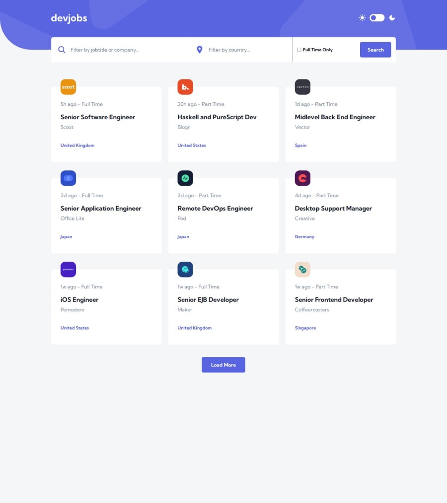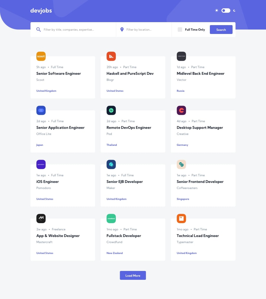
Design comparison
Solution retrospective
Hi Coders! Really liked this project, it's a very good example of looking clean and simple on the outside but has some nifty and bit more complex logic "under the hood". Especially the multiple filtering options and dynamic page routing can create some nice challenges.
I did think the mobile design for the filters(bar) was a bit weird... splitting up the bar into floating. As I really think this clashes with good user-friendly practices, I decided to do my own take on it and create a nice dynamic flexing component for all screen sizes. Also in terms of design I'm kinda missing a feature/button which let the user reset the filters. I might add this later with my own take.
As always; if you have a any comments or improvements let me know!
Community feedback
- P@jakegodsallPosted about 1 year ago
Hi,
I agree with the way that the mobile filter bar is split into a standard filter and a modal is a bit strange. Not to mention the extra complexity in implementing it!
I like how you've worked around it. Great work generally 👍
1
Please log in to post a comment
Log in with GitHubJoin our Discord community
Join thousands of Frontend Mentor community members taking the challenges, sharing resources, helping each other, and chatting about all things front-end!
Join our Discord
