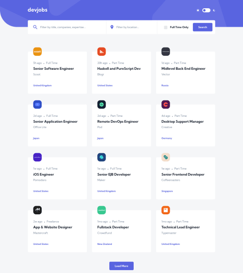
Devjobs app built with Vite and React JS

Solution retrospective
Here is my solution to the challenge, built with Vite and React. I did make a couple tweaks to the design for usability. The Devjobs logo also functions as a "return to home page" button and is tabbable. Also, in mobile view, the magnifying glass button has a higher z-index, so that when the search modal pops up, the magnifying glass button can then be used to close the modal.
I appreciate any feedback and suggestions, especially when it comes to organizing a React project, determining what sections should be their own components, as well as organizing stylesheets and improving accessibility.
Please log in to post a comment
Log in with GitHubCommunity feedback
No feedback yet. Be the first to give feedback on Joshua Dail's solution.
Join our Discord community
Join thousands of Frontend Mentor community members taking the challenges, sharing resources, helping each other, and chatting about all things front-end!
Join our Discord