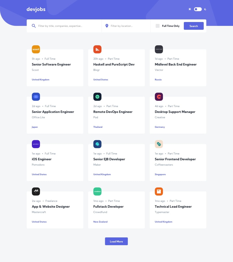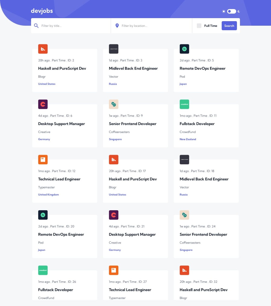
DevJobs App | Vite | React | SASS | TypeScript | React-Virtuoso
Design comparison
Solution retrospective
Built with 🔨
- Vite
- React.js
- TypeScript
- React-Router
- SASS Modules
- React-Virtuoso
I'm always open to suggestions on how to improve on any aspect you think I'm lacking. If you also find any bugs, please don't hesitate to let me know; I would appreciate it a lot.
I hope you guys enjoy it. 😊
Community feedback
- @iDamjanPosted about 1 year ago
Hi,
okay wow, awesome, i am really curious of your coding experience, and how long have you been doing it. You also added test, which is really awesome.
I would add really minor things, my opinions:
- Don't rely on Viewport in the JSX, i think that should be always handled by CSS/SCSS and media queries (in case there is some specific reason i am missing)
- I think you should put all the views/pages in a Views folder or Pages folder and any other view as well, i can see that you added this in Router folder but that may be really confusing :D . As this is a becoming a medium project, with more than 10 components its really hard to navigate.
- I think that you really tried to separate things and make it simpler and you ended up with too many components, and its really hard to navigate and review this. Ideally this should be constructed with up to 5 components i think.
- If there is nothing to load more, then disable the button or hide it.
- Its weird that you can only scroll inside of the jobs, it comes intuitive to scroll in the outside as well
- Interesting update would be to make the search to be live and happening immediatly, its nice improvement.
I hope my comments will help and not only make you angry (I know how comments on PR can make a person angry), but remember this are just my thoughts, your code is awesome and really good job :))
Regards, Damjan
Marked as helpful1@hector535Posted about 1 year agoHi, @iDamjan
thank you so much for taking the time to review my code; I really appreciate that. Angry with you? Why would I? If I didn't want my code to be reviewed, why would I use this platform in the first place? So please, don't be shy and be as harsh as you want; I'm here to improve and be a better developer.
Since you took the time to review my code, the least I can do is answer your questions and provide you with the reasoning behind some of my crazy decisions.
i am really curious of your coding experience, and how long have you been doing it
I have been coding for 5 years so far: 1 year as a back-end developer and currently 4 years as a front-end developer. The transition from back-end to front-end was very tough at the beginning, but it was the best decision made so far. I'm really in love with it.
Don't rely on Viewport in the JSX, i think that should be always handled by CSS/SCSS and media queries (in case there is some specific reason i am missing)
You're completely right on this point; to be honest, I was experimenting a little bit and decided to approach the filterbar layout change using JavaScript so I could render one component when the viewport was under 768 pixels and render another when it was over it. In that way, it would be easier to just swap components depending on the viewport we're in instead of hiding many elements from the screen and shifting others using CSS to accomplish the same result. But yeah, the more performant one would be using CSS, as you mentioned before, instead of using JavaScript.
I think you should put all the views/pages in a Views folder or Pages folder and any other view as well, i can see that you added this in Router folder but that may be really confusing :D . As this is a becoming a medium project, with more than 10 components its really hard to navigate.
I organize my pages the way you mention 😂, but for this project I decided to follow the approach used in the react-router tutorial page, where they have a routes folder and each route behaves as a page, so I gave it a try and really liked it. But I understand it could cause so much confusion for others.
I think that you really tried to separate things and make it simpler and you ended up with too many components, and its really hard to navigate and review this. Ideally this should be constructed with up to 5 components i think.
I think that would be the case if I were using a React UI component library like MUI, AntD, React Bootstrap, etc., which provides you with buttons, checkboxes, selects, cards, etc. But for the challenges provided by this platform, I prefer to complete them by building my own components from scratch because I can learn more about the logic and implications of building those components while at the same time improving my CSS skills. Saying that, it would be extremely challenging for me to complete this challenge with fewer than five components 😅.
If there is nothing to load more, then disable the button or hide it.
Nice observation
Its weird that you can only scroll inside of the jobs, it comes intuitive to scroll in the outside as well
You're completely right. I messed up big time there. There is a lot of improvement to be made here. I will work on it. Thanks for that.
Interesting update would be to make the search to be live and happening immediatly, its nice improvement.
Do you mean caching previously obtained results? That would definitely be a good addition.
So, as you have seen, we all make mistakes 😅, but I'm very glad for your comments, and I want to thank you again for taking the time to review my code. Those little things and details you mentioned are what make us better as professionals, so keep up the good work.
Regards, Héctor.
0
Please log in to post a comment
Log in with GitHubJoin our Discord community
Join thousands of Frontend Mentor community members taking the challenges, sharing resources, helping each other, and chatting about all things front-end!
Join our Discord