Design comparison
Solution retrospective
Your feedback will be highly appreciated. Thanks in Advance.
Community feedback
- @emestabilloPosted over 3 years ago
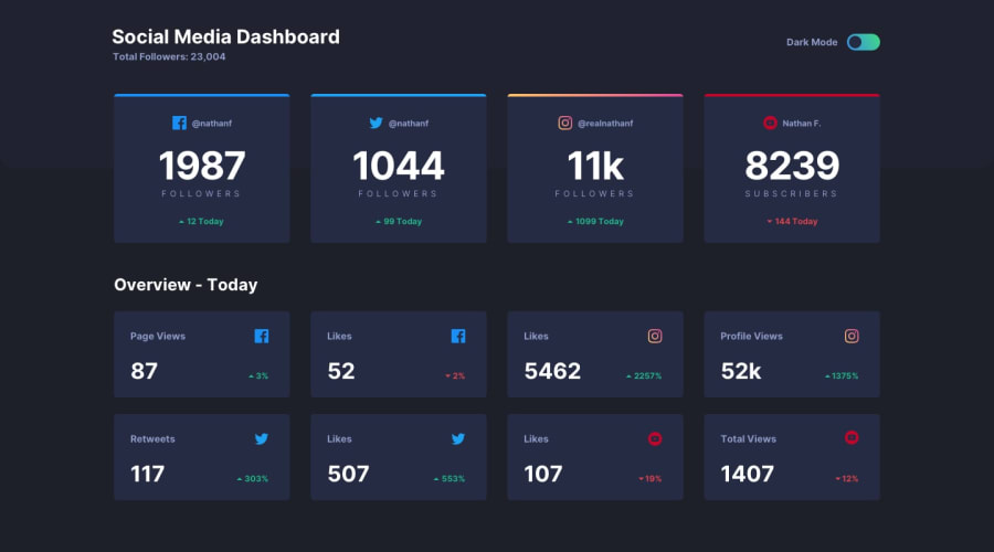
Hi @LuffyDrago, desktop implementation and mobile looks good. It looks like the repo is private so we're not able to check your structure. Just a few things:
-
There's an overflow happening on medium widths, right around 551px to about 835 or so. I suggest adding another breakpoint to handle these screens, maybe have a grid that displays the cards in pairs.
-
Minor alignment and spacing issues like the headings on the large cards where the icons and text are not well-aligned vertically.
-
When dark mode is on, I can hardly see the text right beside the toggle switch. And the text might be the opposite of what you need actually. It has to tell the user what will happen once they toggle, and not what is currently happening on the page. My opinion :-)
Hope this helps!
Marked as helpful0@LuffyDragoPosted over 3 years ago@emestabillo Thank You for your humble reply and taking your time to review my work. I have changed the repo to public. Frankly speaking, I have experienced a challenge in trying to display the grid card in pairs as suggested. Though, I have corrected all other areas. Your assistance in this matter would be greatly appreciated on how to solve it. Thanks in Advance.
1@emestabilloPosted over 3 years ago@LuffyDrago Add a media query around 835px or so, and change your grid template columns to
repeat(2, 1fr). Maybe the main container also needs a max-width since it is expanding wide on large screens. Oh and one more thing, useclasses for styling and notids because they have a high specificity and therefore will be hard to override these styles should you need to in the future. Great job overall!1 -
Please log in to post a comment
Log in with GitHubJoin our Discord community
Join thousands of Frontend Mentor community members taking the challenges, sharing resources, helping each other, and chatting about all things front-end!
Join our Discord
